It is worrying how many people, from the novice visualisation enthusiast to the experienced data scientist, just assume all is well with the underlying dataset and go on to visualise it, feed it through algorithms etc.
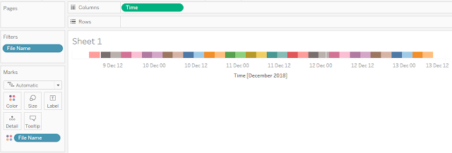
My first use of Flow was to capture DX cluster data. I was requesting an XML every few hours, which contained 500 records. Now the websource is designed for near real time monitoring, not for people like me to download a complete archive. So sometimes 500 records do not go far back enough to avoid having a gap with the previous fetch, as is shown in the morning of the 9th December below. Colouring by the filename (effectively the date and time of fetch) helpfully shows that the gap corresponds to a colour change, and very possibly means there was data loss. On the other hand the gap on the 12th December happens 'within' a particular colour band, i.e. in the middle of a fetched file. So it is probably a genuine lack of activity rather than data loss. I have subsequently changed my flow to do more frequent fetches.
Now compare this slow dying down and picking up again to a data gap below:


No comments:
Post a Comment
Note: only a member of this blog may post a comment.