Showing posts with label Tableau. Show all posts

Sunday, 11 August 2019

A sneak preview of the second Tableau Server Users Group meetup in London

Last month was the second  London Tableau server users group meetup. Jonathan MacDonald went through a long list of tips and tricks for server users and administrators, a few I knew already but also an awful lot that I didn't.

I won't go through all of them, as I wasn't writing them down, or snapping a pic for every single one. I did take the following two pics though. The first trick is that you can append filters to the URL:
and the second one is that you can access an xml containing the server status again through a URL

Friday, 9 August 2019

Extracting the list of coordinates for geographic role 'airport' out of Tableau

Don't they say a picture is a thousand words? All you have to do is navigate to 
C:\Program Files\Tableau\Tableau Public 2019.2\local\data
(modify appropriately for Tableau desktop). Copy the airport tableau source and the GEOCODING database into another folder, drag and drop the tds on tableau and voila, you have the airports and their coordinates! You can even export them to csv for general purpose use.


Sunday, 30 June 2019

Workarounds for getting new 2019.3 features in earlier versions

The 2019.3 beta is out and here's the list of new features. It's nice of Tableau to automate some of the things that could be done with workarounds in previous versions. If you like the new features but are stuck in an old version, or if you are a new kid wanting to know how things were done in ye olden days, follow the links below:
Distance between two points as a calculation
Working with data in UK national grid projected coordinates (haven't tried this script in TabPy to see how slow it would be, worked fine as a standalone python script for data preprocessing)
Pdf subscriptions (courtesy of Interworks)

Sunday, 17 February 2019

Tableau public 2019.1 allows for powerpoint export

You will have noticed, dear reader, that a lot of the images I use in the blog are screenshots of the workbook while it's being edited in Tableau Public, before publishing. Tableau has spared a thought for those like me, and from the latest version allows me to export to PowerPoint even before publishing to Tableau Public.

So from this :
we go to this:
It is basically a powerpoint with the image exports of the sheets, but still quite handy! As a general rule when I want to put Tableau visualisations into powerpoint I observe two rules:
  1. Export the view and legend(s) separately into separate png files, so that the legend does not become diminutively small
  2. When resizing the inserted png file, make sure I keep the aspect ratio of the original.

Monday, 17 December 2018

Operational Intelligence basics: Looking for data loss with a scheduled data feed

It is worrying how many people, from the novice visualisation enthusiast to the experienced data scientist, just assume all is well with the underlying dataset and go on to visualise it, feed it through algorithms etc. 

My first use of Flow was to capture DX cluster data. I was requesting an XML every few hours, which contained 500 records. Now the websource is designed for near real time monitoring, not for people like me to download a complete archive. So sometimes 500 records do not go far back enough to avoid having a gap with the previous fetch, as is shown in the morning of the 9th December below. Colouring by the filename (effectively the date and time of fetch) helpfully shows that the gap corresponds to a colour change, and very possibly means there was data loss. On the other hand the gap on the 12th December happens 'within' a particular colour band, i.e. in the middle of a fetched file. So it is probably a genuine lack of activity rather than data loss. I have subsequently changed my flow to do more frequent fetches. 

But what about the actual lack of activity? We look in a bit more detail by adding frequency in 10s f kHz on the vertical axis and being a bit more careful about accuracy of the thickness on the horizontal axis using the calculated field constant 1/(24*60) for the minute.
Now compare this slow dying down and picking up again to a data gap below:

Tuesday, 17 July 2018

Using Post code Sector GeoJson from TableauMapping.bi

Ok, so this time I'm using https://www.tableaumapping.bi/ properly. I connect using the web connector from tableau Public to https://www.tableaumapping.bi/wdc and chose the Post code Sector table. I then blend in my own data with post code addresses. I use a calculated field to generate the sector from the full post code in my data:
left([postcode],len([postcode])-2) 
and voila! a much more detailed map than the one I got before using only the first half of the postcode.

Monday, 16 July 2018

British MEPs go NUTS

I know what you are thinking, the European Parliament has more than its fair share of nutcases but this is about NUTS as in Nomenclature des unités territoriales statistiques  which are defined across Europe, but we'll take the UK as a case study.

A year and a half ago I looked into grouping counties and unitary authorities together in Tableau to form the European election constituencies in England. This takes a fair amount of work, and I had a dodgy solution with dual axis to avoid having to also group all Scottish, Welsh and Northern Irish counties in a similar way.

A much simpler solution using the latest Tableau functionality is to use NUTS as geographic role. This avoids needing a source to define the constituencies at all, so the data source of the MEPs of each region is enough to also generate maps.

Saturday, 7 July 2018

Splitting the prefix out of a british postcode with no spaces

I came across a dataset this week that had postcodes in this format
Tableau only understands the first half of the postcode, but how do we split it out? Wikipedia as always has a fairly comprehensive description: The outward code (i.e first half) can be from 2 to four characters, but the inward code (second half) is always three characters. Therefore we can isolate the outward code with a calculation:
left([Post Code],len([Post Code])-3)
This now gives the outward code alone in a field that can be given a post code geographic role and  used with the filled map mark type.
And if you do spatial analysis, that little anomaly on the river Thames would have caught your attention. Lets add place names and streets in the map layers and zoom in:

Sunday, 3 June 2018

Simultaneous gantt objects (2018.1 update of using pivot with contracts)

My second post more than a year ago looked at how we find simultaneous gantt type objects. While the method for data preparation still stands, the final plot can be refined a bit thanks to the latest tableau update, the step line type
This now gives a more realistic depiction of the number of concurrent objects and how they change, as it is going to be a step change through integer values rather than a ramp up.

Friday, 1 June 2018

Layering filled maps and polygons on map (2018.1 update)

I wrote about this technique more than a year ago and it was one of my more popular posts, thanks to a tweet by zen master Chris Love. It is time to update the particular example as version 2018.1 finally brings generated Latitude and Longitude closer to Latitude and Longitude already in the dataset.

We start by UNIONing our two sources, the polygon source having latitude and longitude, the mark source having a field that can be interpreted as a filled map.

 We then use the new trick of putting generated latitude and longitude on the axis, with source latitude longitude in the level of detail for the polygon layer. In the past I would import the filled map source, generate the latitudes longitudes, export crosstab to excel, save as csv, and do a union with the polygon csv. No longer necessary as of 2018.1.
Now all that is required is dual axis to overlay the polygon over the filled map.

Tuesday, 29 May 2018

Labelling polygons that go across the prime meridian and its antimeridian


Consider a dataset describing polygons like the one below:

lat lon path polygons
1 1 1 1
-1 1 2 1
-1 -1 3 1
1 -1 4 1
1 1 5 1
1 179 1 2
-1 179 2 2
-1 -179 3 2
1 -179 4 2
1 179 5 2

Tableau doesn't allow you to label polygons directly, therefore the work around is to do dual axis on either latitude or longitude, and create a second layer using the average latitude and longitude of all the vertices of the polygon (key detail, remove the path from the level of detail, while you need it there for the polygon layer) to place the label. 

This works fine apart from any polygons that include points on either side of the antimeridian at 180 degrees longitude, using the convention of 0 to 180 for longitude east, and 0 to -180 for longitude west. The trick here is to detect if the maximum and minimum longitude have different signs and if difference between the maximum and the minimum longitude defines an angle smaller or greater than 180 degrees. In the latter case, the longitude convention needs to be changed to 0 to 360 for the averaging to give sensible results. To achieve that we create a calculated field as shown below and use it in place of the longitude.

if max([Lon])*min([Lon])<0 then
if max([Lon])-min([Lon])>180 then avg(if [Lon]<0 then 360+[Lon] else [Lon] end)
else avg([Lon]) end
else avg([Lon])
end

Sunday, 20 May 2018

Using 24 colours in Tableau

Yet again Tableau tells me it's running out of colours
I've found a solution that works, it also adds a retro touch as it brings back some of the classic template colours us Tableau old timers grew to know and love. 
I click on edit colours, and I select the Classic 20 palette, and then I only change the colours corresponding to 20-23 where it's reusing colours for 0-3, making sure I select the colours in the old palette that no longer exist in the new. 

Saturday, 24 March 2018

Unhiding invisible peaks hidden by the axis

This week I was dealing with a very 'peaky' dataset where the peak was close to the axis. Imagine something starting like this but with thousands of rows following:
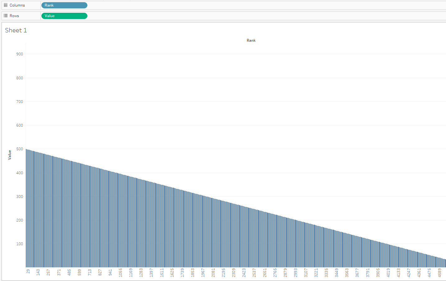
The default bar chart in tableau was hiding the very first mark, which is the big peak, under the axis. Only the axis range going up to a much higher numbers than the visible bars was hinting at the hidden peak.
The mark was there and was becoming visible if I selected it. Selection in tableau by default adds a border, which suggested a solution to make the peak visible:

Wednesday, 29 November 2017

Tableau repositioning itself with regards to data preparation

For those of us that used Tableau for years, the changes in every version always seem to remove some need for external tools/code for data preparation. Think of the introduction of filled maps, the union feature, the excel data interpreter, the pivot and split, the spatial file connector (don't mention the pdf connector!). While certain Tableau partners/consultants are still keen on the Tableau-Alteryx stack, I'm not convinced of its long term market viability, and neither was Gartner last time I checked. The latest announcement on Project Maestro is a rather aggressive move from Tableau's side into traditional Alteryx territory.

If you do want my advice, learn some basic scripting, some coding, regular expressions, some unix or even good editor skills. You can only go so far with 'friendly tools' and you still have to spend a lot of effort learning them, so you might as well learn an open source transferable skill instead.   

Sunday, 26 November 2017

Colouring by secondary source dimension in Tableau, avoiding the asterisk

 The data below is small that you would wonder why I bother blending and not join, or even creating a group. Let's say this is a demonstration of a technique that proved useful with much more big and complicated datasets, and where the non blending dimension of the primary source didn't have an obvious hierarchical relationship with the dimension in the secondary source that yielded the asterisk.

So we have two sources, the primary one lists European election constituency regions per UK nation. The secondary one lists all the MEPs with their region and party
So, how do we blend those two, and do a bar chart of the MEPs of each region with the appropriate party colour coding?

 As you can see, once we put nation as a dimension from the primary source, the secondary source field 'party' cannot be used as a dimension, and we get the dreaded asterisk. Fear not, not all is lost.

There is a work around, but it only works for cases like this where there is a handful of Parties. We create a separate calculated field for each party's MEP, and use measure names on colour, and throw all these party MEP calculated fields on measure values (see screenshot above, calculations below)
if [Party]='CON' or [Party]='UUP' then [MEP] end

if [Party]='LAB' then [MEP] end

if [Party]='UKIP' then [MEP] end

if [Party]='SNP' then [MEP] end

if [Party]!='SNP' and [Party]!='CON' and[Party]!='LAB' and [Party]!='UUP' and [Party]!='UKIP' then [MEP] end
I've given a different scenario of avoiding the asterisk with calculated fields in a blend in a previous post here  

Using human vision's edge detection skills as a colour comparator


When visualising data we have to keep thinking about how human vision works and how can we work in synergy with our viewer's eyes and brain.
Human vision is very good at reconstructing the 3D world from the rather limited information the eye sees, and it can also do that when presented with a 2D image of the 3D world. Artists and scientists have studied and exploited these human abilities.

Basically our brain can do edge detection. It can see that the side of the table cloth is a bit darker than the top of the table, therefore the edge of the table is where the two meet. The luminance component of an image is so much more important to us than the chrominance that we spent nearly a century being amazed at black and white photography and cinema. Even our high tech digital codecs use higher resolution for the luminance than the chrominance components.

In my map visualisations I have tried to exploit this the other way around: use the eye's edge detection ability not so much to find the edge, but to distinguish the light from the dark side. See for example the two maps above. Once we put a hard border line, it saturates our vision, we can no longer see if the East of England or Yorkshire are the darkest blue. This is much like walking in a dark park at night and having a cyclist with strong LED lights coming towards you. You can definitely see the cyclist's light but you can no longer see the path or indeed much else.

The map on the left on the other hand suddenly allows us to make the most of the limited dynamic range. We can now see that the East of England is the darkest blue. It is harder to see the border between areas that are the same colour, but this is a Tableau map, that's what interaction is for. After all quite often these maps are for people who know where the borders are, they are trying to see the borders suggested by the data, not the borders known a priori. Adding a hard border is much like a naive painter's approach: putting more effort into picturing what we know rather than what we see.

Saturday, 25 November 2017

Converting hexadecimal values in Tableau

While Tableau has a lot of basic maths and string functions, coping with hexadecimal numbers is not something it can do natively. Let's see how we can do this with calculated fields.

To make the solution easier we break the problem into two: Interpret each hexadecimal digit, and then put the results together to convert the whole number to decimal. We create a calculated field for the rightmost hex digit (1s)
ifnull(int(right([Hex No],1)), 
case right([Hex No],1) 
when 'a' then 10 
when 'b' then 11 
when 'c' then 12 
when 'd' then 13 
when 'e' then 14 
when 'f' then 15 
end)
We do the same for the next digit (16s) where we can use mid([Hex No],5,1) assuming our numbers are in the format 0x023c. Likewise for the next two digits, 16^2s and 16^3s. Then we bring everything together:
[16^3s]*16*16*16+[16^2s]*16*16+[16s]*16+[1s]

Sunday, 12 November 2017

Working with Eurostat unemployment data in Tableau

Eurostat publishes among other things, unemployment data for the EU. The data is in a weird format, a hybrid between tab and comma separated values.
Having turned it into proper comma separated format, we remove the colons and pivot the years to get a more tableau friendly format:
While the year and quarter can be split, a dateparse calculation is more helpful:
dateparse("yyyy'Q'q",[Pivot Field Names])
 This finally allows us to do some analysis, looking at the unemployment trend for the ten countries of the 2004 accession. Cyprus which I've chosen to highlight is a definite outlier.
It had relatively low unemployment before entering the EU, has a fairly mild recession until the greek PSI when unemployment rises and rises, until the final bail in and associated bank collapse in 2013. This was a double dip, or in the case of unemployment, double peak situation, with the situation improving only to become worse again around the end of 2014 and beginning of 2015. Croatia was the only country of the group in a worse situation until Q3 2016 when the two cross over.  

Sunday, 22 October 2017

Work around for problems with Split function when connecting Tableau to PostgreSQL

I'm a big fan of the split function when doing calculated fields. Partly because far too often, the fields from the sources I work with are concatenations of other fields, or even because I've done a union of several CSV sources and some crucial bit of information is hidden in the table name/path. But recently I tried to use this with PostgreSQL and I got the following error
  • ERROR: function split_part(text[], unknown, integer) does not exist; Error while executing the query
Now I could investigate this further on the PostgreSQL side of things but I just want to get my thing to work and move on. So instead here's the workaround I came up with:
mid([concat_str],start_of_split, find([concat_str],'/',start_of_split)-start_of_split)
where start_of_split is a fixed number of characters (maybe you want to do another find here) and '/' defines the delimiter to use when splitting.

Sunday, 20 August 2017

Tableau and negative zero

Another saga from the big data frontier: at work we have a source of GPS data, and I've been working with a colleague to aggregate it to a degree grid, not unlike the example linked. The data is in hive, and bizarrely it has two columns for each dimension, latitude magnitude as a positive float, and latitude sense as a string (N or S) etc. for longitude. To make our life simple we round the magnitude in the custom SQL that connects to hive, and we make the data signed again with a simple calculation in the Tableau source:
[round Latitude magnitude]*
(case [latitude sense]when 'S' then -1
when 'N' then 1
end)
The rounding of the magnitude is fine as we also keep the sense in the group by dimensions in the custom SQL. The only special case here is when the rounded magnitude is zero, where had we done the sign assignment before the rounding, we'd have one bucket for zero instead of one for 0-0.5 and one for -0.5-0. But surely that shouldn't be an issue once we do the calculation above in tableau?

It turns out that it is an issue. I'm not sure what's happening in the data engine (two's complement going crazy because of negative zero?) but the two zeros are treated differently, recreated with the data of the post linked above.
 Sure enough, looking at the two zeros there's one for -0 and one for +0. So we refine our calculation to avoid multiplying zero by -1

if [round Longitude magnitude]=0 then 0 else
[round Longitude magnitude]*
(case [longitude sense]
when 'W' then -1
when 'E' then 1
end)
end