Sunday 29 January 2017

Mapping the UK's members of the European parliament

How to tutorials on mapping UK regions and blending MEP data to UK regions map.

After a bit of copy paste from online sources, I created a list of UK MEPs, and a list of local authorities in England as well as the 3 devolved administrations of Scotland, Wales and Northern Ireland, which I used for the visualisation below. I will revisit this in future posts for a detailed 'how to'. For the moment I'd like to draw your attention to the fact that any statistics here are based on the number of elected MEPs of each party in each region, and not the actual votes counted.

 I devise a numerical scale to map parties left to right, which is by its very nature arbitrary, and specific to the time (2014) and place (i.e. a UK definition of centre right can be quite different from a French one). I thought it was fair enough to put Lib Dems in the centre after their coalition time, and Labour and Conservatives (including the Ulster Unionists) on either side, with UKIP further right, the regional parties and greens on the left, and the two main parties of Northern Ireland defining far left and far right. Averaging this numerical value of the MEPs of a particular region is used to place it on the Left-Right spectrum, though a closer look at similar scoring regions shows vast differences that can be summarised by the same statistics!


Wednesday 25 January 2017

A first look at Google Data Studio

Let's take a break from Tableau to look at a relatively new player in data visualisation. Google has been sort of doing data analysis and visualisation with Google Analytics being a favourite for website traffic tracking and analysis, and Sheets providing excel type functionality. While you could link your Google Sheet to your Analytics data, it wasn't the best visualisation tool, and in fact Tableau was a popular option for Google Analytics data visualisation. But now the Google Analytics team has a new offering to be used either for an analytics 'custom report' or for any dataset, with some connectors provided.
As a tableau user I can see some similarities but it's quite a different beast. The data source is a bit invisible and it's rather hard changing the way it is used. It takes forever to colour the countries on the map, I can't believe the dataset doesn't have Italy, Portugal or most of the Balkans, not to mention the Baltics, Ireland etc. Less flexible than tableau in building a worksheet, but much more flexible about putting sheets together while continuing to develop them. In any case, it's free so I can't complain too much, but it looks like the beta version is quite slow for a proper demo. I will keep an eye on it as it comes out of Beta.

This follows the lead of Microsoft who integrated it's various 'Power' add ins into Excel trying to upgrade it into a BI tool. It makes sense that other big companies then try to compete with Excel and other dominant players such as Tableau.

Saturday 21 January 2017

Aggregating and propagating field values across asynchronous sources

That was a title full of made up jargon, not even standard database/tableau jargon! Hopefully an example will make it clear.

First of all, what do I mean by asynchronous sources data? It is the sort of data that comes from multiple sources, not at the same times (often from separate files/tables, after a union). A screenshot as usual is worth a thousand words.
 In this example let's assume we have a ship that reports its GPS coordinates every half hour, and the energy consumption on board every minute (it's fitted with a smart meter!). But what if we want to come up with energy usage for each position? The easy solution is to come up with a calculated 'half hour time' that truncates the original timestamps to half hour
left([Time],3)+if int(mid([Time],4,1))<3 then '00' else '30' end
 throw that on the level of detail, the x and y on rows and columns, and sum(E) will do the right thing. All well and good. There's the issue of truncating rather than rounding the time, and not interpolating intermediate positions but let's assume that level of accuracy is not important for this.


But what if the position is not consistently every half hour, what if it is less often when it moves slow, and more often when it moves fast? Then, assuming we still don't need to interpolate intermediate positions, we can avoid aggregation and instead try and fill in the null Xs and Ys using table calculations:
ifnull(attr([X]),previous_value(attr([X])))


This is a more robust method for non-regular interval reports, we can even copy paste it into a new sheet as a clipboard source if the table calculations are an issue.

Today's quick fix

Faced with data looking like in the table below, a bit of calculated field magic does the trick as there is an implied stop date that is not always the same as the start date.

Date
Start
Stop
01/12/2016
01:30
03:00
15/12/2016
05:30
07:00
16/12/2016
12:00
15:30
28/12/2016
21:00
02:30
Start timestamp
 dateparse('dd/MM/yyyy HH:mm',[Date]+' '+[Start])
Stop timestamp
dateparse('dd/MM/yyyy HH:mm',[Date]+' '+[Stop])+(if [Stop]<[Start] then 1 else 0 end)


Wednesday 18 January 2017

Με αφορμή τις Δημοτικές Εκλογές του 2016

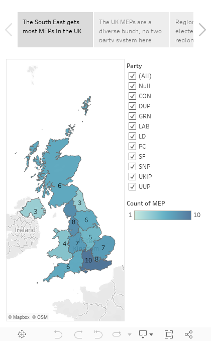
Where Stelios looks at some open data from local elections in Cyprus, and Tableau doesn't do very well mapping districts and local authorities in Cyprus, even when using post codes or groups of post codes.

Το ιστολόγιο παίζει σε δύο ταμπλώ γλωσσικά, θεματολογικά και άλλως πως, που ελάλεν τζιαι η φιλόλογος μου. Στον ελληνοκυπριακό τομέα 😛 κοιτάζουμε τι λέει η Κυπριακή Δημοκρατία από ανοιχτά δεδομένα, χαρτογραφούμε κυπριακά δεδομένα κλπ.

Για να ασχολήθουμε με την πρόσφατη επικαιρότητα, ας κοιτάξουμε τα αποτελέσματα των εκλογών τοπικής αυτοδιοίκησης . Πάνω δεξιά στην ιστοσελίδα υπάρχει ένα εικονίδιο zip για κατέβασμα των αποτελεσμάτων. Τα περιεχόμενα έχουν ένα θέμα με την κωδικοποίηση, τουλάχιστο στα Windows.
Τα αρχεία τουλάχιστον είναι χρησιμοποιήσιμα. Ο πρώτος φάκελος περιέχει τους δήμαρχους σε αρχείο τύπου .xls συν συγκεντρωτικά και αναλυτικά αποτελέσματα σε δύο αρχεία κειμένου .txt
Στο αρχείο με τους δήμαρχους κάτι πάει λάθος με τις επικεφαλίδες.


Η στήλη με τους δήμους περιέχει τες επαρχίες, η στήλη με τις επαρχίες αντίστοιχα περιέχει τους δήμους. Μικρόν το κακό. Ο υπέρτιτλος θα ήταν πρόβλημα με παλιότερες εκδόσεις του tableau αλλά όχι πλέον. Ττικκάρουμε την επιλογή 'use data interpreter':

Μετά ξεκινούμε τη χαρτογράφηση. Μετονομάζουμε τη στήλη Δήμος σε επαρχία, την στήλη επαρχία σε δήμος. Επιλέγουμε για την επαρχία γεωγραφικό ρόλο 'State Province'. Αντιστοιχούμε τα ελληνικά στα αγγλικά ονόματα των επαρχιών επιλέγοντας την Κύπρο σαν χώρα.
Τα πολύγωνα των επαρχιών (marks -> filled map) εν αρκετά χοντροκομμένα, η βάση Ακρωτηρίου μινήσκει εκτός επαρχίας Λεμεσού ενώ ολόκληρη η βάση Δεκέλειας πάει στην επαρχία Αμμοχώστου, ο Απόστολος Αντρέας εν ομοσπονδιακό πάρκο 😀 έξω που την επαρχία Αμμοχώστου.


Αναλόγως καλά σε σχέση με τη χαρτογράφηση των δήμων. Ο γεωγραφικός ρόλος 'City'  ξέρει μόνο τις πρωτεύουσες των επαρχιών συν τον Πρωταρά (???) ενώ μόνο η Λευκωσία αναγνωρίζεται στα ελληνικά. 

Η άλλη επιλογή είναι ο γεωγραφικός ρόλος 'Zip Code/Post Code'. Οι επιλογές είναι μόνο τα πρώτα δύο ψηφία του κώδικα
Σε χάρτη οι κώδικες εν κάπως έτσι:

Στην πράξη πάλε δε γίνεται τίποτε γιατί υπάρχουν περιπτώσεις που 2 δήμοι έχουν τα ίδια πρώτα 2 ψηφία ταχυδρομικού κώδικα, π.χ. Γερμασόγεια-Μέσα Γειτονιά. 

Ο ταχυδρομικός κώδικας μπορεί να χρησιμοποιηθεί για δημιουργία πολυγώνων μεγαλύτερης ακρίβειας για τις επαρχίες, ομαδοποιώντας τους κώδικες της κάθε επαρχίας (νέα πατέντα του tableau 10). Δυστυχώς η πράσινη γραμμή είναι εκτός του πολύγωνου, με αρκετά ακαλαίσθητο αποτέλεσμα. Ολόκληρη η απαγκιστρωμένη ζώνη, Τρούλλοι, Αθηένου κλπ φαίνεται σαν να είναι εκτός ταχυδρομικού κώδικα.  


Thursday 12 January 2017

Pivoting measure names and measure values (caution, doesn't work in Tableau Public)

Let's now consider a data source similar to the contracts, where there is a duration instead of an end date. Easy: we can get the end date with a calculated field. The problem then is we are not given the option to use calculated fields in pivots.
This was a big disappointment for me back when pivots appeared in version 9. I had data in the format above, a python script to do the end date calculation and the pivoting and I was hoping to retire the script. 

I then went to one of the tableau conferences on tour in London. There I learned that you could copy some data in a visualisation, and paste it in a new worksheet, creating a new source from the clipboard. This was useful, and by using this I found a way to do pivots with most fields, as long as they could be expressed as measures. This is very dodgy and I don't recommend it, I should really stick to the Python script. But here is how to do it: 

First of all convert your dates into numbers, as dates can only be dimensions, not measures. Use something like: 
datepart('day',[Start Date])*1000000+datepart('month',[Start Date])*10000+datepart('year',[Start Date])
Then create a view with measure names and measure values showing these 'measure' dates with all other info as a dimension.
 Finally select all the rows, copy and paste into a new worksheet.  Caution: This doesn't work in Tableau Public! If done in Tableau Desktop you get this:

Note how there are two Measure Names and two Measure values, the italics ones are automatically generated, the non italic are fields in the clipboard source, string for the names and number for the measures. So now we have our pivoted field name and field value, and can use calculated fields to restore the dates to a date format as well as recreate our increment calculation
DATE(dateparse('ddMMyyyy',str([Measure Values])))

if [Measure Names]='start' then 1 elseif [Measure Names]='end' then -1 end

Finally here's the workbook:

Monday 9 January 2017

Using the pivot with contracts

2018.1 Update

The contracts dummy data is quite typical of certain troublesome datasets, so I will demonstrate some less boring uses for it.

The Gantt chart is great for visualising but not very useful for doing any further calculations. With this sort of dataset to go any further you need to select the start and end dates and pivot.
The result of the pivot is to put all the dates in the same column, and add a second column telling you whether they are a start or an end date.
So now we can visualise both start and end without a calculated field as they are both on the same date axis. Much more useful though is the following calculated field which I'll call 'increment':
if [Pivot Field Names]='Start Date' then 1 elseif [Pivot Field Names]='End Date' then -1 end
A running sum of increment tells us at any given point the number of 'live' simultaneous contracts.

So finally, here's the visualisation:

Sunday 8 January 2017

Makeover Sunday

This is the first of a series of three posts on the same data source, part II and part III

Hello world,

I've been a tableau user for a while now and finally decided to engage publicly and contribute back to the community.

Makeovers are a tradition in tableau blogging. I'm going to give them a slight twist: I'm not focusing on the look of the visualisation but more on what goes on under the hood. For the first makeover I'm taking inspiration from a recent post by Andre de Vries  . Andre is showcasing an interesting new feature in tableau 10.2 , but he is using a join where not absolutely necessary. As is the case with joins, the resulting dataset has dimensions MxN where M and N the dimensions of the joined datasets.

I recreated Andre's dummy contract data, and used a single calculated field:
Duration=End Date - Start Date
Thus after putting Contracts on Rows and Start Date on Columns (Detail: Exact Date), which Andre does 1:40 min into his video, I also put Duration on the size, which turns the whole thing into the intended Gantt chart.