This is the first of a series of three posts on the same data source, part II and part III
Hello world,
I've been a tableau user for a while now and finally decided to engage publicly and contribute back to the community.
Makeovers are a tradition in tableau blogging. I'm going to give them a slight twist: I'm not focusing on the look of the visualisation but more on what goes on under the hood. For the first makeover I'm taking inspiration from a recent post by Andre de Vries . Andre is showcasing an interesting new feature in tableau 10.2 , but he is using a join where not absolutely necessary. As is the case with joins, the resulting dataset has dimensions MxN where M and N the dimensions of the joined datasets.
I recreated Andre's dummy contract data, and used a single calculated field:

Hello world,
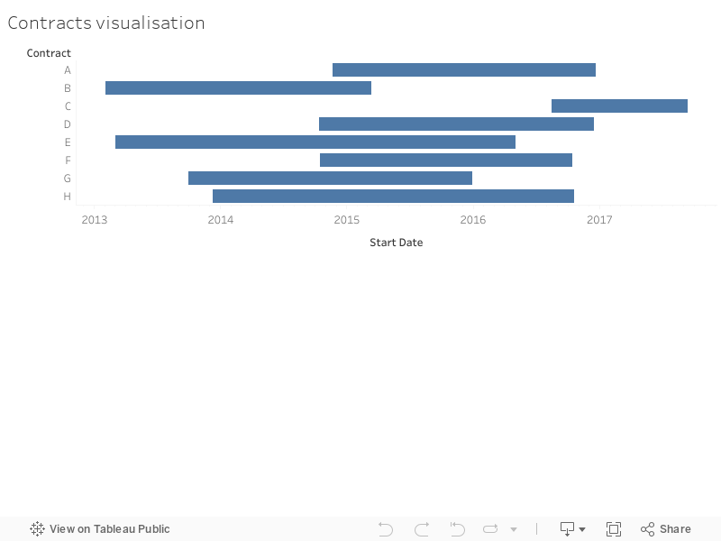
I've been a tableau user for a while now and finally decided to engage publicly and contribute back to the community.
Makeovers are a tradition in tableau blogging. I'm going to give them a slight twist: I'm not focusing on the look of the visualisation but more on what goes on under the hood. For the first makeover I'm taking inspiration from a recent post by Andre de Vries . Andre is showcasing an interesting new feature in tableau 10.2 , but he is using a join where not absolutely necessary. As is the case with joins, the resulting dataset has dimensions MxN where M and N the dimensions of the joined datasets.
I recreated Andre's dummy contract data, and used a single calculated field:
Duration=End Date - Start DateThus after putting Contracts on Rows and Start Date on Columns (Detail: Exact Date), which Andre does 1:40 min into his video, I also put Duration on the size, which turns the whole thing into the intended Gantt chart.

One thing with this is that it doesn't specifically allow you to say "how many are active at a given time", rather it just gives you a Gantt chart. That's why I found Andre's video specifically helpful.
ReplyDeleteHi C0ldCube, thanks for your comment. Have you seen my next blog post who looks exactly at how many are active at a given time? Look for the simultaneous contracts tab http://tableautziaimesa.blogspot.co.uk/2017/01/using-pivot-with-contracts.html
Delete