As a designer of interactive visualisations you have great power and great responsibility to stop the user from doing stupid things. Whoever put Ofcom's media nations report together on Power BI, left the option to the user to tick plotting the responses to multiple questions, with the percentages going well above 100%. I'm not familiar enough with Power BI to know if this is the fault of the software rather than the designer.
Guerrilla techniques for data analysis and mapping. Any opinions are my own and not my current or former employer's
Showing posts with label Tools. Show all posts
Sunday, 8 September 2019
Ofcom's media nations report: Bar chart epic fail
Labels:
bar charts,
infographics,
Microsoft,
Ofcom,
Power BI,
Tools
Sunday, 11 August 2019
A sneak preview of the second Tableau Server Users Group meetup in London
Last month was the second London Tableau server users group meetup. Jonathan MacDonald went through a long list of tips and tricks for server users and administrators, a few I knew already but also an awful lot that I didn't.
I won't go through all of them, as I wasn't writing them down, or snapping a pic for every single one. I did take the following two pics though. The first trick is that you can append filters to the URL:
and the second one is that you can access an xml containing the server status again through a URL
Sunday, 30 June 2019
Workarounds for getting new 2019.3 features in earlier versions
The 2019.3 beta is out and here's the list of new features. It's nice of Tableau to automate some of the things that could be done with workarounds in previous versions. If you like the new features but are stuck in an old version, or if you are a new kid wanting to know how things were done in ye olden days, follow the links below:
Distance between two points as a calculation
Working with data in UK national grid projected coordinates (haven't tried this script in TabPy to see how slow it would be, worked fine as a standalone python script for data preprocessing)
Pdf subscriptions (courtesy of Interworks)
Distance between two points as a calculation
Working with data in UK national grid projected coordinates (haven't tried this script in TabPy to see how slow it would be, worked fine as a standalone python script for data preprocessing)
Pdf subscriptions (courtesy of Interworks)
Tuesday, 25 December 2018
Managing the monthly Flow allocation using a scheduled ftp file grab
Running a flow for every new file in the FTP repository is eating away my monthly allowance
Therefore since I'm not interested in real time monitoring, a more efficient approach is to only fetch files once a day. Note that the ftp directory list gives a body on which we can run a 'foreach' loop, to then only select the wanted files whose filenames satisfy the condition.
If you got this far, Merry Xmas!!!
Monday, 17 December 2018
Operational Intelligence basics: Looking for data loss with a scheduled data feed
It is worrying how many people, from the novice visualisation enthusiast to the experienced data scientist, just assume all is well with the underlying dataset and go on to visualise it, feed it through algorithms etc.
My first use of Flow was to capture DX cluster data. I was requesting an XML every few hours, which contained 500 records. Now the websource is designed for near real time monitoring, not for people like me to download a complete archive. So sometimes 500 records do not go far back enough to avoid having a gap with the previous fetch, as is shown in the morning of the 9th December below. Colouring by the filename (effectively the date and time of fetch) helpfully shows that the gap corresponds to a colour change, and very possibly means there was data loss. On the other hand the gap on the 12th December happens 'within' a particular colour band, i.e. in the middle of a fetched file. So it is probably a genuine lack of activity rather than data loss. I have subsequently changed my flow to do more frequent fetches.
Now compare this slow dying down and picking up again to a data gap below:
Monday, 10 December 2018
Using Excel to turn XML format data into a table
Back in the early noughties when I was trying to learn a bit about web development, XML was all the rage. These days it has been displaced in various applications by json and other formats. Configs, that should have been safe XML territory, are also threatened by json, with Microsoft Flow being an example of such use of json. Even so, a number of legacy uses of XML are still going and it is worth being able to decipher it.
Of course you could simply open an XML file in an editor and do lots of manual editing to turn it into csv. At the other end of the spectrum, scripting languages are good at parsing this format. I have found the Python XML Element Tree library useful for that.
A middle road exists, which is to simply drag and drop the file on Excel. This functionality is hardly surprising given that the excel file format itself is based on XML. Using this example data: http://dxlite.g7vjr.org/?band=vhf&limit=500&xml=1
Ignore the style pop up question, then you get a few options:
Of course you could simply open an XML file in an editor and do lots of manual editing to turn it into csv. At the other end of the spectrum, scripting languages are good at parsing this format. I have found the Python XML Element Tree library useful for that.
A middle road exists, which is to simply drag and drop the file on Excel. This functionality is hardly surprising given that the excel file format itself is based on XML. Using this example data: http://dxlite.g7vjr.org/?band=vhf&limit=500&xml=1
Ignore the style pop up question, then you get a few options:
and finally a warning about schema.
Sticking with all the defaults results in the desired table in excel
Things of course will be more complicated with more complicated XML data, and it will be worth looking at the file in an editor, and considering using a proper script to convert it. But excel can be a useful quick and dirty solution.
Saturday, 8 December 2018
Fixing the flaws of Flow
In a previous post I complained about Flow not being able to compress files on the go. The issue with that was that as my files were not stored locally by default, once I started the archiving process with 7zip it would first cause the download of the file locally, then add it to the archive. Often with a flaky network something would disrupt the download, which would then mess up with the archive. The workaround has been to specify that all the files in that folder are stored locally, thus decoupling the download from the archiving.
I know, not something to write home about. Let's look at the config of the HTTP component in more detail. Oops! There is an automatic decompression button set to 'On' by default! Make sure it's off unless you really want decompression.
As I had a few failed runs, I've changed the retry policy, from the exponential default starting with an interval of seconds, to a fixed interval with quite a few minutes interval. I find this works better for a website that has gone temporarily down, especially given that I don't particularly want the flow to be responding in real time. The fact that this can be done from inside the config rather than by adding more steps to the flow is something I learned from the great Serge Luca in his Sharepoint Saturday presentation.
I know, not something to write home about. Let's look at the config of the HTTP component in more detail. Oops! There is an automatic decompression button set to 'On' by default! Make sure it's off unless you really want decompression.
As I had a few failed runs, I've changed the retry policy, from the exponential default starting with an interval of seconds, to a fixed interval with quite a few minutes interval. I find this works better for a website that has gone temporarily down, especially given that I don't particularly want the flow to be responding in real time. The fact that this can be done from inside the config rather than by adding more steps to the flow is something I learned from the great Serge Luca in his Sharepoint Saturday presentation.
Saturday, 18 August 2018
The flaws of Flow: Can't zip downloaded files
Microsoft Flow has been proving more useful in my Office 365 dominated environment. I've been using the FTP connector to download masses of files to my OneDrive. The OneDrive comes with a 1 TB limit, which is plenty but it is worth trying to keep things compact. Unfortunately, while flow can extract from zipped archives, it can't do the opposite. In order to manually create a zipped archive, the computer downloads all the files, zips them and uploads them back to OneDrive. Gotta love Microsoft!
Sunday, 29 July 2018
Microsoft flow as a last resort in place of cron and windows scheduler
You know the situation: while you are not the biggest fan of MS out there, your employer's IT department are. Of course you don't really have proper access to a Linux system to set up a cronjob to do your data fetching for you, and you don't even have an 'always on' windows machine to be able to do this via Task Scheduler.
Well, you have to make do with what you have, and in this case, that is Office 365, a lesser known component of it called Flow. There is an upside to this to rescue your pride somewhat: while it is a humble office app it uses the same language as azure logic apps, so think of it as cloud training!
Sunday, 20 May 2018
Using 24 colours in Tableau
Yet again Tableau tells me it's running out of colours
I've found a solution that works, it also adds a retro touch as it brings back some of the classic template colours us Tableau old timers grew to know and love.
I click on edit colours, and I select the Classic 20 palette, and then I only change the colours corresponding to 20-23 where it's reusing colours for 0-3, making sure I select the colours in the old palette that no longer exist in the new.
Saturday, 24 March 2018
Unhiding invisible peaks hidden by the axis
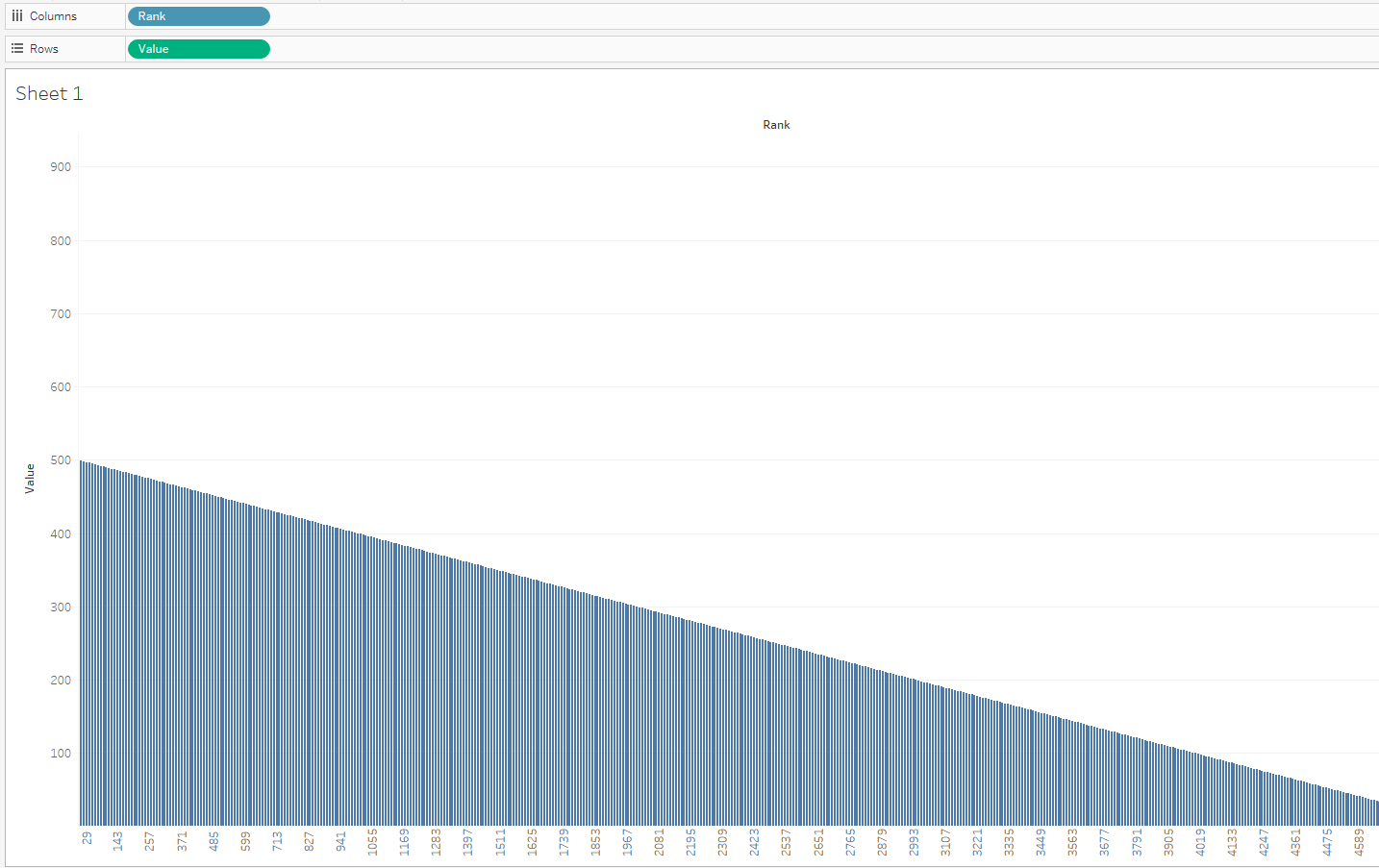
This week I was dealing with a very 'peaky' dataset where the peak was close to the axis. Imagine something starting like this but with thousands of rows following:
The default bar chart in tableau was hiding the very first mark, which is the big peak, under the axis. Only the axis range going up to a much higher numbers than the visible bars was hinting at the hidden peak.
The mark was there and was becoming visible if I selected it. Selection in tableau by default adds a border, which suggested a solution to make the peak visible:
Wednesday, 29 November 2017
Tableau repositioning itself with regards to data preparation
For those of us that used Tableau for years, the changes in every version always seem to remove some need for external tools/code for data preparation. Think of the introduction of filled maps, the union feature, the excel data interpreter, the pivot and split, the spatial file connector (don't mention the pdf connector!). While certain Tableau partners/consultants are still keen on the Tableau-Alteryx stack, I'm not convinced of its long term market viability, and neither was Gartner last time I checked. The latest announcement on Project Maestro is a rather aggressive move from Tableau's side into traditional Alteryx territory.
If you do want my advice, learn some basic scripting, some coding, regular expressions, some unix or even good editor skills. You can only go so far with 'friendly tools' and you still have to spend a lot of effort learning them, so you might as well learn an open source transferable skill instead.
Sunday, 22 October 2017
Work around for problems with Split function when connecting Tableau to PostgreSQL
I'm a big fan of the split function when doing calculated fields. Partly because far too often, the fields from the sources I work with are concatenations of other fields, or even because I've done a union of several CSV sources and some crucial bit of information is hidden in the table name/path. But recently I tried to use this with PostgreSQL and I got the following error
- ERROR: function split_part(text[], unknown, integer) does not exist; Error while executing the query
mid([concat_str],start_of_split, find([concat_str],'/',start_of_split)-start_of_split)where start_of_split is a fixed number of characters (maybe you want to do another find here) and '/' defines the delimiter to use when splitting.
Saturday, 6 May 2017
Histograms and data driven aggregation
Unavoidably, once you start taking your work seriously as 'data science' you have to do hypothesis testing. And to do hypothesis testing you need to know the distribution of your data. And the most intuitive way to see the distribution of your data is to plot a histogram.
So in that context, we have a go at plotting a histogram of a field in our data. The advice of our 'big data' provider is - you guessed it - pull data from Hive into a Spark data frame, do some operations, convert to RDD, do some more operations. I'm too lazy for all that so digging around I found that Hive has a histogram function. You might not like the idea as it returns an array of structures that contain the bin centres and the respective frequencies, and it uses some funky binary delimiters, different for the struct fields, the array elements and of course the fields returned by the query. This is complicated enough to merit its own post which I promise to do in the future, but in my book still preferred: No need to do 20 (or 50?) lines of configuration and functional programming where a SQL one-liner would do.
Anyway, having done that I was looking at another field for which we also needed a histogram, and realised that it is really a discete measurement, it was a number somewhere between 40 and 80 that only came with .00, .25, .50 and .75 in the decimal places. Maybe an unsigned 8 bit quantity at the point of measurement/analog to digital conversion? Anyway, that means that to do a histogram you can avoid the binning all together, the data is pretty much 'pre-binned'. Instead it becomes more like the first classic example of any Map Reduce related tutorial: a word count. How many times does e.g. 50.25 appear in the data, and likewise for all values.
Knowing your data can always save time and effort when trying to analyse it. A key reason to like Tableau is the way it allows you to learn what your dataset looks like and explore it from all possible sides. I have to confess though, the final dataset was simple enough for the histogram to be done as a pivot-chart in Excel!
So in that context, we have a go at plotting a histogram of a field in our data. The advice of our 'big data' provider is - you guessed it - pull data from Hive into a Spark data frame, do some operations, convert to RDD, do some more operations. I'm too lazy for all that so digging around I found that Hive has a histogram function. You might not like the idea as it returns an array of structures that contain the bin centres and the respective frequencies, and it uses some funky binary delimiters, different for the struct fields, the array elements and of course the fields returned by the query. This is complicated enough to merit its own post which I promise to do in the future, but in my book still preferred: No need to do 20 (or 50?) lines of configuration and functional programming where a SQL one-liner would do.
Anyway, having done that I was looking at another field for which we also needed a histogram, and realised that it is really a discete measurement, it was a number somewhere between 40 and 80 that only came with .00, .25, .50 and .75 in the decimal places. Maybe an unsigned 8 bit quantity at the point of measurement/analog to digital conversion? Anyway, that means that to do a histogram you can avoid the binning all together, the data is pretty much 'pre-binned'. Instead it becomes more like the first classic example of any Map Reduce related tutorial: a word count. How many times does e.g. 50.25 appear in the data, and likewise for all values.
Knowing your data can always save time and effort when trying to analyse it. A key reason to like Tableau is the way it allows you to learn what your dataset looks like and explore it from all possible sides. I have to confess though, the final dataset was simple enough for the histogram to be done as a pivot-chart in Excel!
Labels:
Apache,
Big Data,
Data preparation,
data visualisation,
hive,
SQL,
Tableau,
Tools
Monday, 1 May 2017
Why I'm learning Pig
I've made fun of the Apache Pig project the first time I came across it, but I take it back. I now fully see its value and I'm learning how to use it. As there is a lot of ignorant discussion online and offline claiming that Pig and Hive are equivalent tools and that the difference is one of syntax between SQL like (declarative) HiveQL and scripting style procedural Pig Latin, let me explain how I got convinced of the need to use both.
I came to Hadoop gaining access to a system set up for us by a cloud provider, and a lot (but not all) of the data I'm interested in being in HDFS and Hive tables. In that situation, it's taking me a while to figure out what every part of the Hadoop ecosystem does and how it could be useful to me. Hive was the one thing that seemed immediately useful and worth learning: it had a lot of data I was interested in, it sort of follows an accessible standard language (SQL), and it offers quite powerful statistics . An initial presentation on it from the provider claimed it could be used for Hypothesis testing, Predictive Analytics etc., and while that seems a bit misleading in retrospect, Hive can provide all the statistics needed by any specialist tool that does the testing or the prediction. So far so good. I did play with Spark a few times to figure out what it is and how it works, but the barrier to entry there seemed definitely higher: you have to worry about cluster configuration, memory etc. when you launch jobs and you have to use a lot of low level code (RDDs, closures etc.)
One of the knowledge exchange sessions with the provider was on Hadoop being used for ad hoc analysis. Their suggested process was: copy data to HDFS, load data into newly created Hive table, load data from Hive table into Spark dataframe, do certain operations, convert to RDD, do more operations. It seemed awfully complicated. When there was a need to do such analysis, I realised I needed to define a 44 column table schema when I only wanted to average one column grouped by the contents of another, and gave up on using Hadoop at all for the task. It bothered me that I didn't know how to do something this simple on Hadoop though, so I kept reading through books and searching online until Pig emerged as the obvious solution. The syntax for what I wanted to do was ridiculously easy:
So in retrospect: An organisation can adopt Hadoop and throw all its data into a 'data lake' in HDFS. Any competent programmer in that organisation can then use an array of programming approaches (Pig, raw MapReduce, Spark) to analyse this data, some faster to program, others more powerful but requiring more programming effort. This is the fabled 'end of the data warehouse' but only possible if the users of the data can do their own programming. If on the other hand the organisation wants to enable access to the data to non programmer analysts, connect standard BI tools to the data etc. then they adopt Hive, but have to do a lot of the same work that is required for a traditional data warehouse: ETL, normalisation etc. The main advantage of Hive compared to traditional DWH is being able to cope with Big Data that would ground an RDBMS to a halt. In most cases probably a happy medium is reached where key data is in Hive tables, but a lot of other 'niche' data stays in non-structured or non-normalised formats in the data-lake. I have not addressed where NoSQL databases fit into this picture, I promise to come back on the subject when I have a similar NoSQL epiphany.
I came to Hadoop gaining access to a system set up for us by a cloud provider, and a lot (but not all) of the data I'm interested in being in HDFS and Hive tables. In that situation, it's taking me a while to figure out what every part of the Hadoop ecosystem does and how it could be useful to me. Hive was the one thing that seemed immediately useful and worth learning: it had a lot of data I was interested in, it sort of follows an accessible standard language (SQL), and it offers quite powerful statistics . An initial presentation on it from the provider claimed it could be used for Hypothesis testing, Predictive Analytics etc., and while that seems a bit misleading in retrospect, Hive can provide all the statistics needed by any specialist tool that does the testing or the prediction. So far so good. I did play with Spark a few times to figure out what it is and how it works, but the barrier to entry there seemed definitely higher: you have to worry about cluster configuration, memory etc. when you launch jobs and you have to use a lot of low level code (RDDs, closures etc.)
One of the knowledge exchange sessions with the provider was on Hadoop being used for ad hoc analysis. Their suggested process was: copy data to HDFS, load data into newly created Hive table, load data from Hive table into Spark dataframe, do certain operations, convert to RDD, do more operations. It seemed awfully complicated. When there was a need to do such analysis, I realised I needed to define a 44 column table schema when I only wanted to average one column grouped by the contents of another, and gave up on using Hadoop at all for the task. It bothered me that I didn't know how to do something this simple on Hadoop though, so I kept reading through books and searching online until Pig emerged as the obvious solution. The syntax for what I wanted to do was ridiculously easy:
file_data = LOAD 'hdfs://cluster/user/username/file.csv' USING PigStorage(',');
raw_data = FILTER file_data by $0!='field0_name';
data_fields = FOREACH raw_data GENERATE $11 AS file_dimension, (int)$43 AS file_measure;
data_group = GROUP data_fields by file_dimension;
avg_file_measure = FOREACH data_group GENERATE group,AVG(data_fields.file_measure) AS file_measure_avg;This example embodies certain aspects of Pig's philosophy: Pigs eat everything, without necessarily requiring a full schema or being particularly difficult about the delimiter field, or the presence of absence of the csv header (which I filter out in the second line of the example). Pig can go even further working with semi-structured and unstructured, non normalised data, that would be entirely unsuitable for Hive without serious processing. Pigs are domestic animals and rather friendly to the user. One of the early presentations on Pig stated that it "fits the sweet spot between the declarative style of SQL, and the low-level, procedural style of MapReduce". I would dare say that this statement could be updated for the Hadoop 2 world with Spark in place of MapReduce, so it is unsurprising that Pig is still heavily used for ETL and other work on Hadoop, and Pig on Spark is in the works (hopefully delivering on the Pigs fly promise). A final point that Pigs live anywhere should comfort anyone worried about learning such a niche language: it is also supported e.g. on Amazon EMR.
So in retrospect: An organisation can adopt Hadoop and throw all its data into a 'data lake' in HDFS. Any competent programmer in that organisation can then use an array of programming approaches (Pig, raw MapReduce, Spark) to analyse this data, some faster to program, others more powerful but requiring more programming effort. This is the fabled 'end of the data warehouse' but only possible if the users of the data can do their own programming. If on the other hand the organisation wants to enable access to the data to non programmer analysts, connect standard BI tools to the data etc. then they adopt Hive, but have to do a lot of the same work that is required for a traditional data warehouse: ETL, normalisation etc. The main advantage of Hive compared to traditional DWH is being able to cope with Big Data that would ground an RDBMS to a halt. In most cases probably a happy medium is reached where key data is in Hive tables, but a lot of other 'niche' data stays in non-structured or non-normalised formats in the data-lake. I have not addressed where NoSQL databases fit into this picture, I promise to come back on the subject when I have a similar NoSQL epiphany.
Wednesday, 15 March 2017
Big Data World day 1 review
This event was today at Excel in London. It is handily co-located with Cloud and Smart IoT events, which was a major draw for me, as I am not strictly speaking a data/IT guy, more of an analyst and wannabe subject matter expert with IoT and increasingly cloud within my professional interests. As the write up is quite long the following list of links lets you jump to the summary of the relevant presentation:
I did start from the Cloud Expo end of the room as there was a whole 'theatre' devoted to talks on software defined networks. Judging from the first presentation which looked at SD-WANs, these guarantee the exact opposite of net neutrality to business users, prioritising cloud business applications at the expense of e.g. YouTube traffic. The technology involves 'aggregating and orchestrating' a variety of links of varying performance and availability from MPLS and 3G to old school internet, and intelligent path control for different applications' traffic, e.g. routing VoIP traffic through MPLS, thus being able to guarantee QoS above 'best effort'. Interesting ideas on SLAs for application uptime and even application performance could extend the current SLAs of network availability. To my simplistic brain, it would all be simpler and safer if we keep most applications offline and standalone, instead of putting everything on the cloud, but there's a cloud enabled industrial revolution in progress, which involves cost cutting and getting rid of half the IT department. Clearly that is the main driver, with the downside being increasing demands on the network.
In complete contrast, I moved on to a presentation in the Big Data World area on the General Data Protection Regulation. This made me feel suddenly quite nostalgic for the good old EU, its much maligned courts and the human right to a private life. The list of non EU countries that conform to european data protection standards is interesting to say the least: Andorra, Argentina, Canada, Faeroe Islands, Guernsey, Israel, Isle of Man, Jersey, New Zealand, Switzerland and Uruguay. Maybe there's material there for a tableau map and some spatial insights!
Next was SelectStar, a database monitoring solution. Their main selling point is being a single monitoring tool for all database technologies, as increasingly companies will have a mixture of open source and proprietary relational and NoSQL solutions, rather than be an e.g. 'all Oracle' house. I was hoping to get some tips on actual monitoring of the health of a Hadoop cluster, but they don't do much in addition to what the built in Hadoop monitoring tools offer, in fact Hadoop is quite a recent addition to their offerings.
I try and balance attending presentations relevant to my job to things that are just plain interesting. In the spirit of the latter, I went to the 'deep learning' keynote, which as one member of the audience noted, was using mostly image recognition examples. The presenter explained that they make good presentation material, and the technique has wider applications. The key thing I took from this was that the feature extraction is now also 'trainable', whereas in old school machine learning only the classification stage was. I'm not fully convinced machines are better than humans at deciding what the best feature vector is, and I should read up on any speech/music processing applications of this as I have a better theoretical grounding in that field. Would a machine ever come up with something as brilliant but crazy as the cepstrum?
I next attended a talk on deriving 'actionable insight' from data. This is now such a cliche that is a bit meaningless, especially when the whole brigade of viz whizz kids are into dashboard visualisations with little accompanying text, carrying little of the insight a well illustrated text heavy report will give you. Refreshingly, and perhaps tellingly on the differing priorities of the private and public sector data world, the speaker used no visual material whatsoever. He just talked about his work as a data analyst for Peterborough city council, and projects such as identifying unregistered rental properties by fusing a variety of datasets including council tax and library user details, or analysing crime patterns! I should look into what open data offerings they have.
The weather company, finally a (nearly) household name, was next, in a keynote on weather for business. They interestingly crowdsource some of their data to achieve 'hyperlocal' resolution of 500m, 96 times a day globally, while a major sector of their corporate customers, airlines, are also data providers. They have a unique data processing platform and the speaker did put a certain emphasis on their acquisition by IBM and the 'insights and cognition' synergies that will result from it.
I then ventured into the Smart IoT area for a talk from O2/Telefónica. The data protection theme was present here again as they make sure their data is secure and anonymous via aggregation and extrapolation, and a certain amount of weeding out of any data that is not aggregated enough and therefore could be used to identify individual users, and users consenting to the use of their data also came up during question time. They derive location via both 'active' (calls) and 'passive' (cell handovers) means, as well as behavioural data from apps and websites visited, and 'in venue' information from their wifi hotspots and small cells (another hint at the seamless integration of multiple networks mentioned earlier). This builds up to 6 billion events on a typical day, and they keep an archive of 4 years. These events are classified into 'settles' and 'journeys', analysed to identify origins and destinations, with uses ranging from transport planning, audience profiling, retail decision making etc.
Back to the other end of the hall to hear self professed ubergeek Andi Mann of Splunk on DevOps . Follow the link as he can summarise his ideas much better than I can. He gave me another interesting fact on Yahoo's past as a cool tech parent company, despite today's headlines on security breaches: the presentation on dev and ops cooperation at Flickr that was key to starting the devops conversation back in 2009. I think the idea of devops has applications outside software, in fact a lot of the operational intelligence work I do sits somewhere between operations and product/service development.
I did skip the QlikView presentation for the sake of Splunk, but came back to the Big Data keynotes for Esri. Their presentation focused on the benefits of spatial analysis, giving the grid aggregation I wrote about in the past as an example, along with navigation, fraud transaction detection and even insurance for ships going into pirate infested waters!
Finally a joint act between Wejo and Talend on their connected car project. This was interesting for many reasons, from the technologies involved on the car such as eCall to the technology used for data processing, as Talend offers an open source ETL tool that can sit on top of Spark. On that latter front there was a certain emphasis on the benefits of having a unified infrastructure for batch processing and streaming, and a mention of the Apache Beam project as something Talend will support in the future to that end.
In the time left between all this I got to talk to some of the exhibitors. The most intriguing one was a Belgian company who make Anatella, which would catch the eye of anyone working in telecoms for their binary CDR processing capability. The demos included some fascinating social network graph analysis derived from phone calls: e.g. flemish speaking belgians tend to call other flemish speaking belgians and french speaking belgians tend to call other french speaking belgians, with the exception of Brussels, which proves to be bilingual territory not only in constitutional theory but also in telephony practice! There was a news story a few years ago on similar telephone 'connections' between UK regions, I remember Wales being split in three north to south, with more contact with the corresponding adjacent english region to the east than the rest of wales north and/or south. Fascinating work that can escape the narrow confines of marketing into proper Geography research, not unlike the work of the Flowminder Foundation that I link to on the right.
- SD-WAN (Cloud Expo)
- General Data Protection Regulation
- SelectStar database monitoring tool
- Deep Learning
- Deriving actionable insight from data
- The weather company
- O2 Telefónica (Smart IoT)
- Data for DevOps (Cloud Expo)
- Esri on Spatial Analysis
- Talend and Wejo on connected car
- ETL for CDRs with Anatella
I did start from the Cloud Expo end of the room as there was a whole 'theatre' devoted to talks on software defined networks. Judging from the first presentation which looked at SD-WANs, these guarantee the exact opposite of net neutrality to business users, prioritising cloud business applications at the expense of e.g. YouTube traffic. The technology involves 'aggregating and orchestrating' a variety of links of varying performance and availability from MPLS and 3G to old school internet, and intelligent path control for different applications' traffic, e.g. routing VoIP traffic through MPLS, thus being able to guarantee QoS above 'best effort'. Interesting ideas on SLAs for application uptime and even application performance could extend the current SLAs of network availability. To my simplistic brain, it would all be simpler and safer if we keep most applications offline and standalone, instead of putting everything on the cloud, but there's a cloud enabled industrial revolution in progress, which involves cost cutting and getting rid of half the IT department. Clearly that is the main driver, with the downside being increasing demands on the network.
In complete contrast, I moved on to a presentation in the Big Data World area on the General Data Protection Regulation. This made me feel suddenly quite nostalgic for the good old EU, its much maligned courts and the human right to a private life. The list of non EU countries that conform to european data protection standards is interesting to say the least: Andorra, Argentina, Canada, Faeroe Islands, Guernsey, Israel, Isle of Man, Jersey, New Zealand, Switzerland and Uruguay. Maybe there's material there for a tableau map and some spatial insights!
Next was SelectStar, a database monitoring solution. Their main selling point is being a single monitoring tool for all database technologies, as increasingly companies will have a mixture of open source and proprietary relational and NoSQL solutions, rather than be an e.g. 'all Oracle' house. I was hoping to get some tips on actual monitoring of the health of a Hadoop cluster, but they don't do much in addition to what the built in Hadoop monitoring tools offer, in fact Hadoop is quite a recent addition to their offerings.
I try and balance attending presentations relevant to my job to things that are just plain interesting. In the spirit of the latter, I went to the 'deep learning' keynote, which as one member of the audience noted, was using mostly image recognition examples. The presenter explained that they make good presentation material, and the technique has wider applications. The key thing I took from this was that the feature extraction is now also 'trainable', whereas in old school machine learning only the classification stage was. I'm not fully convinced machines are better than humans at deciding what the best feature vector is, and I should read up on any speech/music processing applications of this as I have a better theoretical grounding in that field. Would a machine ever come up with something as brilliant but crazy as the cepstrum?
I next attended a talk on deriving 'actionable insight' from data. This is now such a cliche that is a bit meaningless, especially when the whole brigade of viz whizz kids are into dashboard visualisations with little accompanying text, carrying little of the insight a well illustrated text heavy report will give you. Refreshingly, and perhaps tellingly on the differing priorities of the private and public sector data world, the speaker used no visual material whatsoever. He just talked about his work as a data analyst for Peterborough city council, and projects such as identifying unregistered rental properties by fusing a variety of datasets including council tax and library user details, or analysing crime patterns! I should look into what open data offerings they have.
The weather company, finally a (nearly) household name, was next, in a keynote on weather for business. They interestingly crowdsource some of their data to achieve 'hyperlocal' resolution of 500m, 96 times a day globally, while a major sector of their corporate customers, airlines, are also data providers. They have a unique data processing platform and the speaker did put a certain emphasis on their acquisition by IBM and the 'insights and cognition' synergies that will result from it.
I then ventured into the Smart IoT area for a talk from O2/Telefónica. The data protection theme was present here again as they make sure their data is secure and anonymous via aggregation and extrapolation, and a certain amount of weeding out of any data that is not aggregated enough and therefore could be used to identify individual users, and users consenting to the use of their data also came up during question time. They derive location via both 'active' (calls) and 'passive' (cell handovers) means, as well as behavioural data from apps and websites visited, and 'in venue' information from their wifi hotspots and small cells (another hint at the seamless integration of multiple networks mentioned earlier). This builds up to 6 billion events on a typical day, and they keep an archive of 4 years. These events are classified into 'settles' and 'journeys', analysed to identify origins and destinations, with uses ranging from transport planning, audience profiling, retail decision making etc.
Back to the other end of the hall to hear self professed ubergeek Andi Mann of Splunk on DevOps . Follow the link as he can summarise his ideas much better than I can. He gave me another interesting fact on Yahoo's past as a cool tech parent company, despite today's headlines on security breaches: the presentation on dev and ops cooperation at Flickr that was key to starting the devops conversation back in 2009. I think the idea of devops has applications outside software, in fact a lot of the operational intelligence work I do sits somewhere between operations and product/service development.
I did skip the QlikView presentation for the sake of Splunk, but came back to the Big Data keynotes for Esri. Their presentation focused on the benefits of spatial analysis, giving the grid aggregation I wrote about in the past as an example, along with navigation, fraud transaction detection and even insurance for ships going into pirate infested waters!
Finally a joint act between Wejo and Talend on their connected car project. This was interesting for many reasons, from the technologies involved on the car such as eCall to the technology used for data processing, as Talend offers an open source ETL tool that can sit on top of Spark. On that latter front there was a certain emphasis on the benefits of having a unified infrastructure for batch processing and streaming, and a mention of the Apache Beam project as something Talend will support in the future to that end.
In the time left between all this I got to talk to some of the exhibitors. The most intriguing one was a Belgian company who make Anatella, which would catch the eye of anyone working in telecoms for their binary CDR processing capability. The demos included some fascinating social network graph analysis derived from phone calls: e.g. flemish speaking belgians tend to call other flemish speaking belgians and french speaking belgians tend to call other french speaking belgians, with the exception of Brussels, which proves to be bilingual territory not only in constitutional theory but also in telephony practice! There was a news story a few years ago on similar telephone 'connections' between UK regions, I remember Wales being split in three north to south, with more contact with the corresponding adjacent english region to the east than the rest of wales north and/or south. Fascinating work that can escape the narrow confines of marketing into proper Geography research, not unlike the work of the Flowminder Foundation that I link to on the right.
Labels:
Big Data,
CDR,
data protection,
GIS,
Hadoop,
IoT,
maps,
open data,
Splunk,
Telecommunications data,
Tools,
Yahoo
Wednesday, 8 February 2017
The story of Pig
Yahoo! (don't forget the exclamation mark!) nowadays makes the news for all the bad reasons: Takeover by other companies, hacked by unnamed state actors several times in the past, not to mention the very dodgy advertising all over their websites. It wasn't always thus.
Cast your minds back to the mid noughties, and you'll remember Yahoo! acquiring the smaller stars of the web 2.0 constellation: Flickr which they kept, Delicio.us which they sold on and Upcoming which they retired. Of course Yahoo! had a history of acquiring companies with great products and messing them up previously, from GeoCities to LAUNCHcast. But by 2005 it seemed like they were suddenly getting it and becoming cool.
On the technology side, Yahoo! was a pioneer of Big Data, with Open Source projects such as Hadoop (the writer of that first blog post, Jeremy Zawodny, did later sum up the story of that time nicely in his personal blog), Pig and other bits of that ecosystem that became part of an Apache project rather than a proprietary product.
One wonders if they would be better off now had they kept it as their own product. Maybe they would be the giants of cloud computing. Releasing it as open source though meant that it became an effective industry standard, with other companies contributing projects such as Hive (in fact have a look at this blog post that details the use for both Pig and Hive inside Yahoo. If only someone updated it to add Spark SQL to the mix!). So if anything, if Yahoo! goes down, the Apache Hadoop ecosystem will probably survive.
Cast your minds back to the mid noughties, and you'll remember Yahoo! acquiring the smaller stars of the web 2.0 constellation: Flickr which they kept, Delicio.us which they sold on and Upcoming which they retired. Of course Yahoo! had a history of acquiring companies with great products and messing them up previously, from GeoCities to LAUNCHcast. But by 2005 it seemed like they were suddenly getting it and becoming cool.
On the technology side, Yahoo! was a pioneer of Big Data, with Open Source projects such as Hadoop (the writer of that first blog post, Jeremy Zawodny, did later sum up the story of that time nicely in his personal blog), Pig and other bits of that ecosystem that became part of an Apache project rather than a proprietary product.
One wonders if they would be better off now had they kept it as their own product. Maybe they would be the giants of cloud computing. Releasing it as open source though meant that it became an effective industry standard, with other companies contributing projects such as Hive (in fact have a look at this blog post that details the use for both Pig and Hive inside Yahoo. If only someone updated it to add Spark SQL to the mix!). So if anything, if Yahoo! goes down, the Apache Hadoop ecosystem will probably survive.
Friday, 3 February 2017
Pig history, features, application and operations
Subscribe to:
Posts (Atom)