2018.1 Update
The contracts dummy data is quite typical of certain troublesome datasets, so I will demonstrate some less boring uses for it.
The Gantt chart is great for visualising but not very useful for doing any further calculations. With this sort of dataset to go any further you need to select the start and end dates and pivot.
 The result of the pivot is to put all the dates in the same column, and add a second column telling you whether they are a start or an end date.
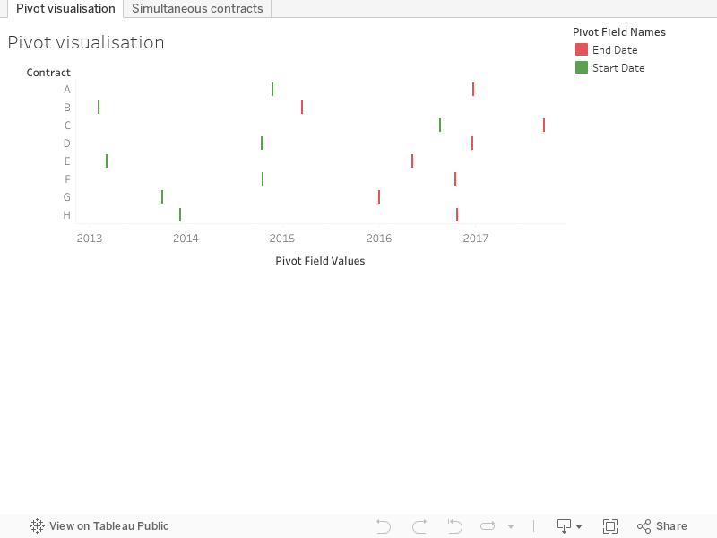
 So now we can visualise both start and end without a calculated field as they are both on the same date axis. Much more useful though is the following calculated field which I'll call 'increment':

So finally, here's the visualisation:
The contracts dummy data is quite typical of certain troublesome datasets, so I will demonstrate some less boring uses for it.
The Gantt chart is great for visualising but not very useful for doing any further calculations. With this sort of dataset to go any further you need to select the start and end dates and pivot.


if [Pivot Field Names]='Start Date' then 1 elseif [Pivot Field Names]='End Date' then -1 endA running sum of increment tells us at any given point the number of 'live' simultaneous contracts.

So finally, here's the visualisation:
No comments:
Post a Comment
Note: only a member of this blog may post a comment.