Thursday, 23 February 2017

Re-Make Thursday

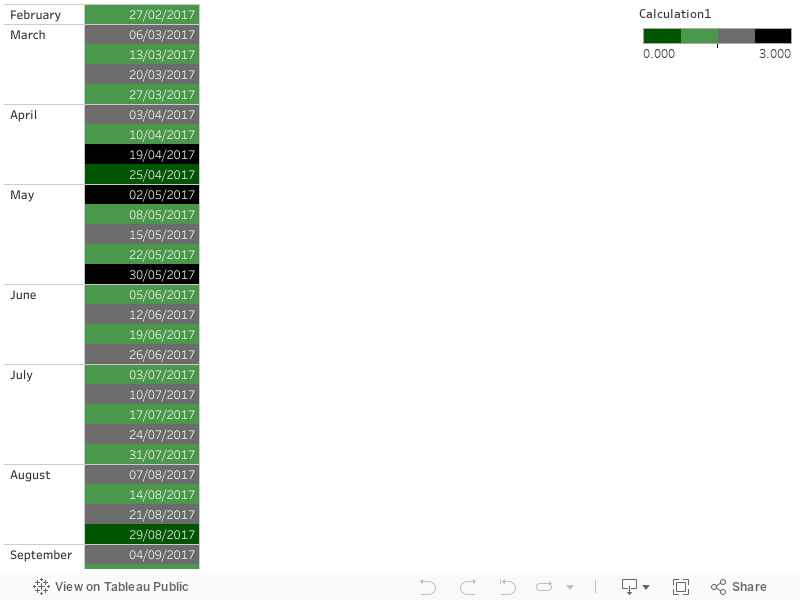
Not a makeover this time but a re-make. The data comes from my local council: They collect the recycling and the rubbish on alternate weeks, and because the collection day is a Monday, it gets collected later in the week when there are bank holidays. The colour scheme they selected is very sensible: colour by bin colour, stronger colours for the weeks when the collection happens later because of bank holidays.

I thought I could do it with a calculated field that calculates odd and even weeks
float(DATEPART( 'week', [Collection Days])/2 - int(DATEPART( 'week', [Collection Days])/2))
and colour by that and by whether it's Monday or not
DATEPART('weekday', [Collection Days])=2
However, the coloured box with text in it only works if the colour is driven by a continuous variable, rather than by a discrete one (or a discrete and a boolean, as in my original plan).

So we have to colour by a continuous variable, and counter-intuitively, the dark colours are at the two ends and the light colours in the middle. The mark is square and the label is the date.
if [odd even week]=0 and not [Monday?] then 0.0 elseif [odd even week]=0 and [Monday?] then 1.0 elseif [odd even week]=0.5 and [Monday?] then 2.0 elseif [odd even week]=0.5 and not [Monday?] then 3.0 end 


Saturday, 18 February 2017

The girl with the dragon infographic

I still haven't read 'The girl with the dragon tattoo'. I have read another book that wouldn't have been published without the Millennium trilogy's success, the biography of the author: Stieg, from activist to author. Stieg Larsson was a fascinating character, in some ways personifying the whole generation that came of age in the late sixties and early seventies.
He grew up in the north of Sweden, liked drawing and shortwave listening, and as a teenager became an activist against the Vietnam war. He did his military service after finishing school, some odd jobs, and spent a short stint in Eritrea training female guerrillas on mortars and getting very ill. Not quite the guerrilla techniques this blog is supposed to focus on, I hear you say.
So here's the twist: having returned to Sweden he moved to the capital, Stockholm and ended up with a temporary job for the press agency TT. Let's get the rest of the story from Jan-Erik Petersson's biography, in Tom Geddes' translation:
 'At TT Stieg began by writing up sports results and the like until, standing in for a colleague, he had a chance to display his talent for illustrating articles with diagrams, boxes, and other devices, and this led to the offer of a permanent position. He was to stay with TT for twenty years. 
Stieg Larsson had not studied journalism and had not been taken on as a reporter. He had created his own corner - news graphics - where he was something of a pioneer at TT. [...]Stieg dealt mainly with urgent jobs for news cables. If an aeroplane had crashed in Guadeloupe, he would draw a map of the area with the crash site marked in.
He worked on his own, producing maps, graphics and diagrams in the form of boxes and circles with his special tools - fine-nibbed pens, transfer letters, a caption machine, a scalpel. It was a real craft, at least until the late 1980s when Adobe introduced its Illustrator program.
Sounds like the heroic age of mapping and data visualisation! Though as a Tableau warrior you can carve a similar niche in your organisation as the go-to person, especially for maps, if everyone else is using less capable tools. If you spend some effort to learn QGIS,even better! Stieg also put his skills in the service of the causes he believed in:
[in] the early 1980s, he was still active in the Socialist party and had begun writing for its weekly magazine Internationalen. He submitted articles on national service for women, on the New Age movement and superstition; he drew a map of US and Soviet military bases and nuclear weapons facilities throughout the world.   
You can get an anthology of Larsson's non fiction, The Expo files  (with a Tariq Ali introduction, here's the Guardian review and the Telegraph review), but as the title suggests, it is focused on his writing for Expo, investigating neonazis. It does feature a piece on New Age from Internationalen, though unfortunately not the map of nuclear weapons facilities. Perhaps the next tribute publication after the Expo files and the autobiography could be a 'best of' his news graphics?

Sunday, 12 February 2017

Makeover Sunday II

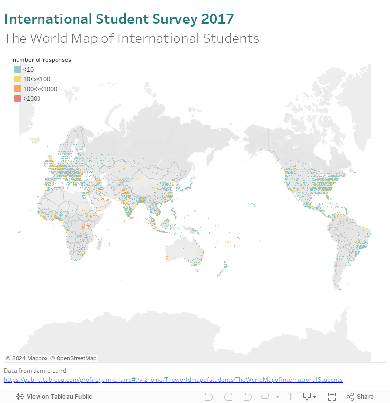
This time I'm using a dataset from Jamie Laird, original workbook on Tableau Public . Having worked in remote sensing before, I like the idea of a map as pixels of so many kilometres by so many kilometres, or so many degrees by so many degrees latitude and longitude. This dataset behaves well with Tableau's default Mercator projection(only projection using built in maps) . If you have data closer to the poles you might want to force a geographic projection by using your own map background image.

As always, a couple of calculated fields come handy.
Truncated Latitude and Longitude:
int([Latitude])
int([Longitude]) 
Aggregate the number of responses and force a logarithmic colour scale, with appropriate legend:
case int(log(COUNTD([Response ID])))
when 0 then '<10'
when 1 then '10<x<100'
when 2 then '100<x<1000'
when 3 then '>1000'
end
Some footnotes on presentation: make sure you have no border or halo on the marks (controlled through colour), and if you really want to treat the marks as individual pixels use the square mark type.

Wednesday, 8 February 2017

The story of Pig

Yahoo! (don't forget the exclamation mark!) nowadays makes the news for all the bad reasons: Takeover by other companies, hacked by unnamed state actors several times in the past, not to mention the very dodgy advertising all over their websites. It wasn't always thus.

Cast your minds back to the mid noughties, and you'll remember Yahoo! acquiring the smaller stars of the web 2.0 constellation: Flickr which they kept, Delicio.us which they sold on and Upcoming which they retired. Of course Yahoo! had a history of acquiring companies with great products and messing them up previously, from GeoCities to LAUNCHcast. But by 2005 it seemed like they were suddenly getting it and becoming cool.

On the technology side, Yahoo! was a pioneer of Big Data, with Open Source projects such as Hadoop (the writer of that first blog post, Jeremy Zawodny, did later sum up the story of that time nicely in his personal blog), Pig and other bits of that ecosystem that became part of an Apache project rather than a proprietary product.

One wonders if they would be better off now had they kept it as their own product. Maybe they would be the giants of cloud computing. Releasing it as open source though meant that it became an effective industry standard, with other companies contributing projects such as Hive (in fact have a look at this blog post that details the use for both Pig and Hive inside Yahoo. If only someone updated it to add Spark SQL to the mix!). So if anything, if Yahoo! goes down, the Apache Hadoop ecosystem will probably survive.

Sunday, 5 February 2017

Blending MEP data to UK regions map

This part 3 of my MEP analysis: after presenting the Tableau visualisation and discussing the creation of the map, I look into using the list of all UK MEPs as a secondary datasource blended with the map.
Counting the MEPs per English region is the easier case. Region is the linking field, and we can filter on a field from the secondary source (Party) with no problem, as we are using a simple aggregation, the count (CNT). For Scotland etc. the added complication is having to link on the devolved administration which we throw into the level of detail of the relevant 'Latitude (generated)' mark.


I mentioned that the count is a simple aggregation, other similar aggregations that 'tolerate' filters from secondary sources are SUM and AVG. Things get trickier when trying to look at parties, as we have to use the distinct count. We only want to count a party once in each region it occurs in, not once for every MEP.

So how do we filter, e.g. for regional vs. UK wide parties? This is a classic case were a parameter is necessary. We right click at the bottom left, choose 'Create Parameter' and give the options we want in the menu:
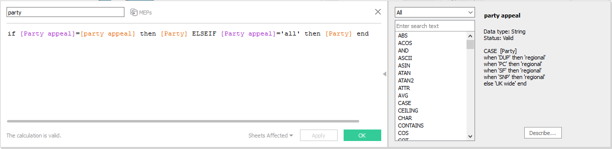
Then we also create a (lower case) party calculated field driven by the parameter and we use the distinct count of this calculated field for the label and the colour:
This deals with one major issue with using secondary sources. Now let's consider another one. We've grouped our parties by regional and UK wide appeal, and we don't want to filter, but we want the tooltip to tell us what party appeal MEPs a region has as we hover over the map with the mouse. Tableau likes to aggregate anything coming from the secondary source along the linking dimensions, so it will aggregate the appeal of parties of each region, and the default aggregation for a string is ATTR(). This is perfectly fine in England where no regional parties get elected, it will return 'UK wide'. But what about the devolved administrations where regional and UK wide parties are both represented? There's a dirty hack, and as usual it involves a calculated field.

min([party appeal])+(if max([party appeal])!=min([party appeal]) then ' & '+MAX([party appeal]) else '' end)
MIN and MAX on strings is fine when there are only two options like in this case, so now instead of the hated '*' our devolved regions return 'UK wide & regional'. If we were dealing with a string field that had more than two values, MIN and MAX could still be useful to return an 'a-z' type range, if applicable. If it gets too complicated, maybe a blend is seriously limiting the analysis and another approach should be followed.

Friday, 3 February 2017

Pig history, features, application and operations

Would you consider a training course with the agenda below?
• History of Pig
• What is Pig and Why Pig
• Pig Vs. MapReduce
• Features of Pig and Its Application
• Pig Data Model and Pig Operations
I think I'll stick to Hive .

Wednesday, 1 February 2017

Mapping the UK regions

For a more up to date and simpler approach see a later post using NUTS geographic role. Both grouping filled map areas and dual axis maps are very worthwhile techniques so I feel this tutorial is still useful.

In this post I'll guide you through making the maps used in the visualisation of UK MEPs I published last time.

For our raw data we turn to wikipedia's Regions of England. Following the link for each region we go to the 'Local government' part, where we copy the table into Excel.
 Tableau knows the 'County/Unitary' field, once you clean it up a bit and give it county as the geographic role. This is with the exception of the starred fields above (e.g. Greater Manchester and Merseyside) where tableau knows the metropolitan boroughs, not the metropolitan country, so you have to break it to separate rows for each borough. In tableau you then will get the map below:
Group the unitary authorities/counties/boroughs to regions, and use that in place of the county in level of detail. This gives us the maps of England, but what about Scotland, Wales and Northern Ireland?

You could go and find all the counties etc. there, but there is a much simpler way. Add Scotland, Wales and Northern Ireland rows with the names in the same field as the names of english counties. Then duplicate the field in Tableau and this time change geographic role to State/Province. Then drag Longitude (generated) next to the already existing Longitude (generated) for columns, and change the level of detail of the map to this State/Province field. You should get two maps next to each other:
Now all you need to do is click on the Longitude and select dual axis and voila! a map with the UK regions. Don't worry too much about the 121 unknown, it should be all the counties/authorities/boroughs that didn't match 'England' and are not shown on the map on the left, plus the 3 States/Provinces that didn't match a county name and are not shown on the map to the right. As long as you have no gaps in the dual axis map you should be fine.

The dual axis does cause a number of weird behaviours. E.g. right click on the sheet, select 'Duplicate as Crosstab' and you get two new sheets, one crosstab for each map. So for some applications you might want to avoid dual axis, and list all the counties of Wales, Scotland and Northern Ireland instead.