Following on from the
talk from a Peterborough council employee in Big Data world, I had a look for their open data. They have an impressive portal at
http://data.peterborough.gov.uk/ , the platform in use (Data Share) is developed by the London borough of Redbridge.
I chanced upon the topical dataset of split of social and affordable housing allocations between British nationals, Europeans and other foreigners. This is of special interest not only because the issue of EU citizens benefits has been at the centre of the Brexit debate, but also because Peterborough has been singled out in a couple of newspaper articles as a place that helps understand the brexit vote (
already from the last general election,
following the UKIP referendum campaign, and
in the aftermath).
Data share has a funny start page where you follow one link to view data and another to download it, each leading to categories of datasets, and each category's link to the list of datasets in the category. Quite a lot of clicking through, especially if you first view and then decide to download. Thankfully there is actually a download button in the viewing area.
Viewing the data shows a table but gives some other options, the interface reminds me a bit of the built in visualisations in the
Zeppelin Notepad.
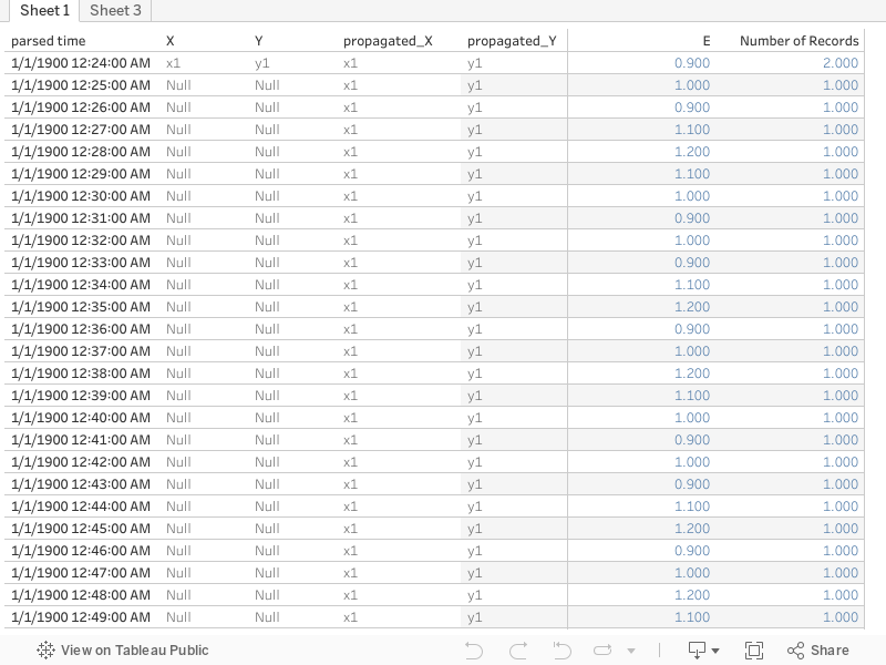
This doesn't live up to the promise though, try any view other than the table and what you get is a visualisation of the number of records in the table per value of the dimension selected for the category axis, not even fitting in one page and not in chronological order either!
It does look like the Peterborough data and the Data share platform haven't been tuned to work with each other when it comes to visualisation. Changing the dimension for the category axis becomes even more revealing:
So this is a bit like the modal value of my CPD hours :) . I have a visualisation telling me that there are two records/quarters in the dataset for which there were 197 houses allocated to british nationals, as opposed to having only one quarter for which 200 houses were allocated. This might interest a conspiracy theorist with numerology fixations, but is far from insightful. Downloading the data and playing with it even in excel can get you a bit further, though the 'Apr-Jun 10' format is not great. Instead we load into tableau, split the period and modify the year to four digits:
'20'+TRIM( SPLIT( [Period], " ", 2 ) )
We also pivot the various nationalities to give a more tableau friendly format
The remaining issue is the occasional 0-3 value, which might be there to 'anonymize' the dataset rather than single out the hypothetical one Czech family that got a council house in a particular quarter of a particular year. Change the data type to number(whole) which is fine with all other values and gives null for the 0-3 and then add another calculation
ifnull([Pivot Field Values],3)
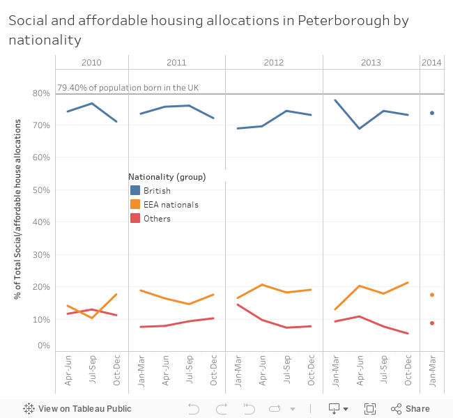
I could have used zn and turned them to zeros, but if the hypothesis we are investigating is 'the bad immigrants take all the houses' we need to take the 'worst' case scenario. Now the total number of houses allocated fluctuates so looking at percent of total allocations with the table calculation computed at the cell level (i.e. percent of the total for the quarter) we can see how the relative percentages of nationalities fluctuate. As the nationalities are already partially grouped, I group the eastern Europeans in with the rest of the EEA nationals. I also stick in one crucial number from the UKIP campaign Grauniad article: 79.4% of Peterborough's population were born in the UK. Of course there are plenty of British nationals not born in the UK, but lets use what numbers we have at hand.
The end result shows that the percentage of British nationals getting social and affordable housing hovers just under the percentage of British born people in Peterborough. I can guess here that if you are rich or at least well off in Peterborough you are more likely to be British (an assumption that wouldn't necessarily hold in London), so we really need the percentage nationalities of people who can't afford market rent in Peterborough. But in any case it shows that things are not as bad as the benefit tourist story wants you to think. After all many of the EEA nationals in council housing could be working in the warehouses mentioned in the more recent Grauniad article. Which boils the question down to why does the British government not enforce a living wage more strictly, if the benefit seekers are a drain on the national finances.