Showing posts with label Data preparation. Show all posts

Sunday, 30 June 2019

Workarounds for getting new 2019.3 features in earlier versions

The 2019.3 beta is out and here's the list of new features. It's nice of Tableau to automate some of the things that could be done with workarounds in previous versions. If you like the new features but are stuck in an old version, or if you are a new kid wanting to know how things were done in ye olden days, follow the links below:
Distance between two points as a calculation
Working with data in UK national grid projected coordinates (haven't tried this script in TabPy to see how slow it would be, worked fine as a standalone python script for data preprocessing)
Pdf subscriptions (courtesy of Interworks)

Monday, 10 December 2018

Using Excel to turn XML format data into a table

Back in the early noughties when I was trying to learn a bit about web development, XML was all the rage. These days it has been displaced in various applications by json and other formats. Configs, that should have been safe XML territory, are also threatened by json, with Microsoft Flow being an example of such use of json. Even so, a number of legacy uses of XML are still going and it is worth being able to decipher it.

Of course you could simply open an XML file in an editor and do lots of manual editing to turn it into csv. At the other end of the spectrum, scripting languages are good at parsing this format. I have found the Python XML Element Tree library useful for that.

A middle road exists, which is to simply drag and drop the file on Excel. This functionality is hardly surprising given that the excel file format itself is based on XML. Using this example data: http://dxlite.g7vjr.org/?band=vhf&limit=500&xml=1
Ignore the style pop up question, then you get a few options:
and finally a warning about schema.
Sticking with all the defaults results in the desired table in excel
Things of course will be more complicated with more complicated XML data, and it will be worth looking at the file in an editor, and considering using a proper script to convert it. But excel can be a useful quick and dirty solution.

Saturday, 18 August 2018

The flaws of Flow: Can't zip downloaded files

Microsoft Flow has been proving more useful in my Office 365 dominated environment. I've been using the FTP connector to download masses of files to my OneDrive. The OneDrive comes with a 1 TB limit, which is plenty but it is worth trying to keep things compact. Unfortunately, while flow can extract from zipped archives, it can't do the opposite. In order to manually create a zipped archive, the computer downloads all the files, zips them and uploads them back to OneDrive. Gotta love Microsoft!

Sunday, 29 July 2018

Microsoft flow as a last resort in place of cron and windows scheduler

You know the situation: while you are not the biggest fan of MS out there, your employer's IT department are. Of course you don't really have proper access to a Linux system to set up a cronjob to do your data fetching for you, and you don't even have an 'always on' windows machine to be able to do this via Task Scheduler.

Well, you have to make do with what you have, and in this case, that is Office 365, a lesser known component of it called Flow. There is an upside to this to rescue your pride somewhat: while it is a humble office app it uses the same language as azure logic apps, so think of it as cloud training!

Saturday, 7 July 2018

Splitting the prefix out of a british postcode with no spaces

I came across a dataset this week that had postcodes in this format
Tableau only understands the first half of the postcode, but how do we split it out? Wikipedia as always has a fairly comprehensive description: The outward code (i.e first half) can be from 2 to four characters, but the inward code (second half) is always three characters. Therefore we can isolate the outward code with a calculation:
left([Post Code],len([Post Code])-3)
This now gives the outward code alone in a field that can be given a post code geographic role and  used with the filled map mark type.
And if you do spatial analysis, that little anomaly on the river Thames would have caught your attention. Lets add place names and streets in the map layers and zoom in:

Tuesday, 30 January 2018

Converting UK national grid to latitude longitude Python function from Hannah Fry

I found Hannah Fry's python function useful with a dataset in national grid coordinates. It's not something that could be done easily in a Tableau calculated field as it is an iterative calculation that converges to the solution. Hannah Fry does have a Tableau connection though; she was a keynote speaker in the London Tableau conference on tour a few years ago. That presentation gave some key insights on Tom Cruise's central upper tooth, as well as showing pictures of two clones of Hannah with symmetrical faces, one based on the left side of her face and one based on the right hand side!

Wednesday, 29 November 2017

Tableau repositioning itself with regards to data preparation

For those of us that used Tableau for years, the changes in every version always seem to remove some need for external tools/code for data preparation. Think of the introduction of filled maps, the union feature, the excel data interpreter, the pivot and split, the spatial file connector (don't mention the pdf connector!). While certain Tableau partners/consultants are still keen on the Tableau-Alteryx stack, I'm not convinced of its long term market viability, and neither was Gartner last time I checked. The latest announcement on Project Maestro is a rather aggressive move from Tableau's side into traditional Alteryx territory.

If you do want my advice, learn some basic scripting, some coding, regular expressions, some unix or even good editor skills. You can only go so far with 'friendly tools' and you still have to spend a lot of effort learning them, so you might as well learn an open source transferable skill instead.   

Saturday, 25 November 2017

Converting hexadecimal values in Tableau

While Tableau has a lot of basic maths and string functions, coping with hexadecimal numbers is not something it can do natively. Let's see how we can do this with calculated fields.

To make the solution easier we break the problem into two: Interpret each hexadecimal digit, and then put the results together to convert the whole number to decimal. We create a calculated field for the rightmost hex digit (1s)
ifnull(int(right([Hex No],1)), 
case right([Hex No],1) 
when 'a' then 10 
when 'b' then 11 
when 'c' then 12 
when 'd' then 13 
when 'e' then 14 
when 'f' then 15 
end)
We do the same for the next digit (16s) where we can use mid([Hex No],5,1) assuming our numbers are in the format 0x023c. Likewise for the next two digits, 16^2s and 16^3s. Then we bring everything together:
[16^3s]*16*16*16+[16^2s]*16*16+[16s]*16+[1s]

Sunday, 12 November 2017

Working with Eurostat unemployment data in Tableau

Eurostat publishes among other things, unemployment data for the EU. The data is in a weird format, a hybrid between tab and comma separated values.
Having turned it into proper comma separated format, we remove the colons and pivot the years to get a more tableau friendly format:
While the year and quarter can be split, a dateparse calculation is more helpful:
dateparse("yyyy'Q'q",[Pivot Field Names])
 This finally allows us to do some analysis, looking at the unemployment trend for the ten countries of the 2004 accession. Cyprus which I've chosen to highlight is a definite outlier.
It had relatively low unemployment before entering the EU, has a fairly mild recession until the greek PSI when unemployment rises and rises, until the final bail in and associated bank collapse in 2013. This was a double dip, or in the case of unemployment, double peak situation, with the situation improving only to become worse again around the end of 2014 and beginning of 2015. Croatia was the only country of the group in a worse situation until Q3 2016 when the two cross over.  

Sunday, 22 October 2017

Work around for problems with Split function when connecting Tableau to PostgreSQL

I'm a big fan of the split function when doing calculated fields. Partly because far too often, the fields from the sources I work with are concatenations of other fields, or even because I've done a union of several CSV sources and some crucial bit of information is hidden in the table name/path. But recently I tried to use this with PostgreSQL and I got the following error
  • ERROR: function split_part(text[], unknown, integer) does not exist; Error while executing the query
Now I could investigate this further on the PostgreSQL side of things but I just want to get my thing to work and move on. So instead here's the workaround I came up with:
mid([concat_str],start_of_split, find([concat_str],'/',start_of_split)-start_of_split)
where start_of_split is a fixed number of characters (maybe you want to do another find here) and '/' defines the delimiter to use when splitting.

Sunday, 20 August 2017

Tableau and negative zero

Another saga from the big data frontier: at work we have a source of GPS data, and I've been working with a colleague to aggregate it to a degree grid, not unlike the example linked. The data is in hive, and bizarrely it has two columns for each dimension, latitude magnitude as a positive float, and latitude sense as a string (N or S) etc. for longitude. To make our life simple we round the magnitude in the custom SQL that connects to hive, and we make the data signed again with a simple calculation in the Tableau source:
[round Latitude magnitude]*
(case [latitude sense]when 'S' then -1
when 'N' then 1
end)
The rounding of the magnitude is fine as we also keep the sense in the group by dimensions in the custom SQL. The only special case here is when the rounded magnitude is zero, where had we done the sign assignment before the rounding, we'd have one bucket for zero instead of one for 0-0.5 and one for -0.5-0. But surely that shouldn't be an issue once we do the calculation above in tableau?

It turns out that it is an issue. I'm not sure what's happening in the data engine (two's complement going crazy because of negative zero?) but the two zeros are treated differently, recreated with the data of the post linked above.
 Sure enough, looking at the two zeros there's one for -0 and one for +0. So we refine our calculation to avoid multiplying zero by -1

if [round Longitude magnitude]=0 then 0 else
[round Longitude magnitude]*
(case [longitude sense]
when 'W' then -1
when 'E' then 1
end)
end 

Saturday, 6 May 2017

Histograms and data driven aggregation

Unavoidably, once you start taking your work seriously as 'data science' you have to do hypothesis testing. And to do hypothesis testing you need to know the distribution of your data. And the most intuitive way to see the distribution of your data is to plot a histogram.

So in that context, we have a go at plotting a histogram of a field in our data. The advice of our 'big data' provider is - you guessed it - pull data from Hive into a Spark data frame, do some operations, convert to RDD, do some more operations. I'm too lazy for all that so digging around I found that Hive has a histogram function. You might not like the idea as it returns an array of structures that contain the bin centres and the respective frequencies, and it uses some funky binary delimiters, different for the struct fields, the array elements and of course the fields returned by the query. This is complicated enough to merit its own post which I promise to do in the future, but in my book still preferred: No need to do 20 (or 50?) lines of configuration and functional programming where a SQL one-liner would do.

Anyway, having done that I was looking at another field for which we also needed a histogram, and realised that it is really a discete measurement, it was a number somewhere between 40 and 80 that only came with .00, .25, .50 and .75 in the decimal places. Maybe an unsigned 8 bit quantity at the point of measurement/analog to digital conversion? Anyway, that means that to do a histogram you can avoid the binning all together, the data is pretty much 'pre-binned'. Instead it becomes more like the first classic example of any Map Reduce related tutorial: a word count.  How many times does e.g. 50.25 appear in the data, and likewise for all values.

Knowing your data can always save time and effort when trying to analyse it. A key reason to like Tableau is the way it allows you to learn what your dataset looks like and explore it from all possible sides. I have to confess though, the final dataset was simple enough for the histogram to be done as a pivot-chart in Excel!

Monday, 1 May 2017

Why I'm learning Pig

I've made fun of the Apache Pig project the first time I came across it, but I take it back. I now fully see its value and I'm learning how to use it. As there is a lot of ignorant discussion online and offline claiming that Pig and Hive are equivalent tools and that the difference is one of syntax between SQL like (declarative) HiveQL and scripting style procedural Pig Latin, let me explain how I got convinced of the need to use both.

I came to Hadoop gaining access to a system set up for us by a cloud provider, and a lot (but not all) of the data I'm interested in being in HDFS and Hive tables. In that situation, it's taking me a while to figure out what every part of the Hadoop ecosystem does and how it could be useful to me. Hive was the one thing that seemed immediately useful and worth learning: it had a lot of data I was interested in, it sort of follows an accessible standard language (SQL), and it offers quite powerful statistics . An initial presentation on it from the provider claimed it could be used for Hypothesis testing, Predictive Analytics etc., and while that seems a bit misleading in retrospect, Hive can provide all the statistics needed by any specialist tool that does the testing or the prediction. So far so good. I did play with Spark a few times to figure out what it is and how it works, but the barrier to entry there seemed definitely higher: you have to worry about cluster configuration, memory etc. when you launch jobs and you have to use a lot of low level code (RDDs, closures etc.)

One of the knowledge exchange sessions with the provider was on Hadoop being used for ad hoc analysis. Their suggested process was: copy data to HDFS, load data into newly created Hive table, load data from Hive table into Spark dataframe, do certain operations, convert to RDD, do more operations. It seemed awfully complicated. When there was a need to do such analysis, I realised I needed to define a 44 column table schema when I only wanted to average one column grouped by the contents of another, and gave up on using Hadoop at all for the task. It bothered me that I didn't know how to do something this simple on Hadoop though, so I kept reading through books and searching online until Pig emerged as the obvious solution. The syntax for what I wanted to do was ridiculously easy:
file_data = LOAD 'hdfs://cluster/user/username/file.csv' USING PigStorage(',');
raw_data = FILTER file_data by $0!='field0_name';
data_fields = FOREACH raw_data GENERATE $11 AS file_dimension,  (int)$43 AS file_measure;
data_group = GROUP data_fields by file_dimension;
avg_file_measure = FOREACH data_group GENERATE group,AVG(data_fields.file_measure) AS file_measure_avg;
This example embodies certain aspects of Pig's philosophy: Pigs eat everything, without necessarily requiring a full schema or being particularly difficult about the delimiter field, or the presence of absence of the csv header (which I filter out in the second line of the example). Pig can go even further working with semi-structured and unstructured, non normalised data, that would be entirely unsuitable for Hive without serious processing. Pigs are domestic animals and rather friendly to the user. One of the early presentations on Pig stated that it "fits the sweet spot between the declarative style of SQL, and the low-level, procedural style of MapReduce". I would dare say that this statement could be updated for the Hadoop 2 world with Spark in place of MapReduce, so it is unsurprising that Pig is still heavily used for ETL and other work on Hadoop, and Pig on Spark is in the works (hopefully delivering on the Pigs fly promise). A final point that Pigs live anywhere should comfort anyone worried about learning such a niche language: it is also supported e.g. on Amazon EMR.

So in retrospect: An organisation can adopt Hadoop and throw all its data into a 'data lake' in HDFS. Any competent programmer in that organisation can then use an array of programming approaches (Pig, raw MapReduce, Spark) to analyse this data, some faster to program, others more powerful but requiring more programming effort. This is the fabled 'end of the data warehouse' but only possible if the users of the data can do their own programming. If on the other hand the organisation wants to enable access to the data to non programmer analysts, connect standard BI tools to the data etc. then they adopt Hive, but have to do a lot of the same work that is required for a traditional data warehouse: ETL, normalisation etc. The main advantage of Hive compared to traditional DWH is being able to cope with Big Data that would ground an RDBMS to a halt. In most cases probably a happy medium is reached where key data is in Hive tables, but a lot of other 'niche' data stays in non-structured or non-normalised formats in the data-lake. I have not addressed where NoSQL databases fit into this picture, I promise to come back on the subject when I have a similar NoSQL epiphany.

Tuesday, 28 March 2017

Statistics of statistics


In looking at the pie charts of CPD hours we found that the sum of averages was the average of the sums, whereas the sum of medians was much smaller than the median of the sums. This is another way of saying that the average is a linear function, i.e. it is true that


f(ax+by)=af(x)+bf(y)
whereas the median is non linear. This is quite important from a visualisation point of view as pie charts, stacked bar charts, area graphs etc. imply that the sum of the parts is a meaningful quantity, and in the case of non linear aggregations (median, countd) often it isn’t.

In tables Tableau addresses this with ‘grand total’, the aggregation for which doesn’t have to be a sum but could be e.g. an overall median. If you’ve been careful to never imply the parts can be summed but still find your users exporting data and doing sums in excel, adding a table view with a grand total configured to the suitable aggregation can save you from hours of arguing!

Another case of statistics of statistics in Tableau can arise when using Level of Detail Calculations. I used to do this manually by doing counts at ‘exact date’ level of detail, exporting the counts to excel, re-importing the counts to tableau and then finding the weekly maximum of the counts, effectively using Tableau as my data warehouse/ETL tool as well as the analysis and visualisation tool. The emergence of Level of Detail calculations saved me from all this bother, as now I could plot a
max({fixed [date]:count([x])})
against the date to the nearest week.

Of course there are also cases of using data from a proper data warehouse, whether the traditional RDBMS one or Hive. In that case again it is worth being careful to match any aggregation done in Tableau to the aggregation done in the data warehouse. e.g Min([min_x])can’t go wrong, but the averages can be a bit tricky. Say the original SQL was
SELECT avg(x) AS avg_x GROUP BY d
where d1 has 1 record and d2 has 100! Coming then in Tableau to do an avg([avg_x]) is just asking for trouble. Instead modify the SQL to
SELECT avg(x) AS avg_x, count(1) AS n GROUP BY d
and then we can get the proper average in Tableau with
SUM([avg_x]*[n])/SUM([n])

Sunday, 26 February 2017

Layering marks and polygons on map

This is a trick that has become much simpler to perform since the introduction of union in Tableau 9.3.

We start with two data files, one with the vertices of our polygons and another with the locations where we want the marks. We create a union of those two when we create our tableau data source.
the wildcard union is particularly handy for multiple files so keep it in mind, in this case we don't really need it. What we then need to do is select the Latitude and the lat columns, right click and select 'Merge mismatched fields', likewise for the longitudes.

Then we can create our map with these merged latitudes and longitudes, but we really want to create two maps, one for each layer. Here's how to create the marks map:
Beware of the averaged coordinates, if you don't put all the dimensions in the level of detail you might not get a mark for each row in your dataset! And here's how to create the polygon:

Now we need to select dual axis and right click and hide the 'Null' location.This will give us the desired two layer map.

As it happens, my marks are the centroids of post-codes. So we can tell tableau that through the geographic role of the location field, and select filled maps as the type of mark to get the postcode polygon instead of the dot at the centroid. Note that the (generated) Latitude and Longitude is no good for this as it is not visible when editing the source and cannot be merged with the mismatched latitude longitude of the polygon source after the union, they can't even be used in calculated fields which could be another way round (the pre-9.3 way of doing things). So an original text only source might have to be imported into tableau and the generated coordinates will have to be copied to a new source to use for a union.


Wednesday, 1 February 2017

Mapping the UK regions

For a more up to date and simpler approach see a later post using NUTS geographic role. Both grouping filled map areas and dual axis maps are very worthwhile techniques so I feel this tutorial is still useful.

In this post I'll guide you through making the maps used in the visualisation of UK MEPs I published last time.

For our raw data we turn to wikipedia's Regions of England. Following the link for each region we go to the 'Local government' part, where we copy the table into Excel.
 Tableau knows the 'County/Unitary' field, once you clean it up a bit and give it county as the geographic role. This is with the exception of the starred fields above (e.g. Greater Manchester and Merseyside) where tableau knows the metropolitan boroughs, not the metropolitan country, so you have to break it to separate rows for each borough. In tableau you then will get the map below:
Group the unitary authorities/counties/boroughs to regions, and use that in place of the county in level of detail. This gives us the maps of England, but what about Scotland, Wales and Northern Ireland?

You could go and find all the counties etc. there, but there is a much simpler way. Add Scotland, Wales and Northern Ireland rows with the names in the same field as the names of english counties. Then duplicate the field in Tableau and this time change geographic role to State/Province. Then drag Longitude (generated) next to the already existing Longitude (generated) for columns, and change the level of detail of the map to this State/Province field. You should get two maps next to each other:
Now all you need to do is click on the Longitude and select dual axis and voila! a map with the UK regions. Don't worry too much about the 121 unknown, it should be all the counties/authorities/boroughs that didn't match 'England' and are not shown on the map on the left, plus the 3 States/Provinces that didn't match a county name and are not shown on the map to the right. As long as you have no gaps in the dual axis map you should be fine.

The dual axis does cause a number of weird behaviours. E.g. right click on the sheet, select 'Duplicate as Crosstab' and you get two new sheets, one crosstab for each map. So for some applications you might want to avoid dual axis, and list all the counties of Wales, Scotland and Northern Ireland instead.

Saturday, 21 January 2017

Aggregating and propagating field values across asynchronous sources

That was a title full of made up jargon, not even standard database/tableau jargon! Hopefully an example will make it clear.

First of all, what do I mean by asynchronous sources data? It is the sort of data that comes from multiple sources, not at the same times (often from separate files/tables, after a union). A screenshot as usual is worth a thousand words.
 In this example let's assume we have a ship that reports its GPS coordinates every half hour, and the energy consumption on board every minute (it's fitted with a smart meter!). But what if we want to come up with energy usage for each position? The easy solution is to come up with a calculated 'half hour time' that truncates the original timestamps to half hour
left([Time],3)+if int(mid([Time],4,1))<3 then '00' else '30' end
 throw that on the level of detail, the x and y on rows and columns, and sum(E) will do the right thing. All well and good. There's the issue of truncating rather than rounding the time, and not interpolating intermediate positions but let's assume that level of accuracy is not important for this.


But what if the position is not consistently every half hour, what if it is less often when it moves slow, and more often when it moves fast? Then, assuming we still don't need to interpolate intermediate positions, we can avoid aggregation and instead try and fill in the null Xs and Ys using table calculations:
ifnull(attr([X]),previous_value(attr([X])))


This is a more robust method for non-regular interval reports, we can even copy paste it into a new sheet as a clipboard source if the table calculations are an issue.

Thursday, 12 January 2017

Pivoting measure names and measure values (caution, doesn't work in Tableau Public)

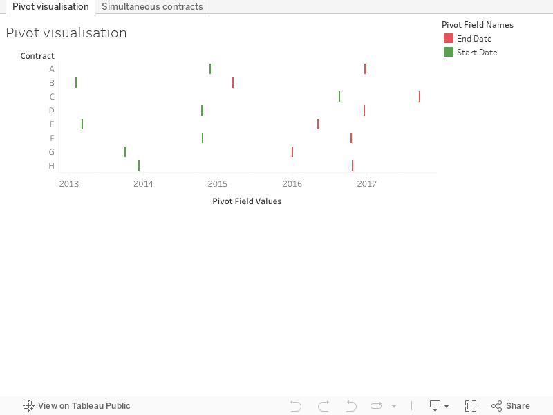
Let's now consider a data source similar to the contracts, where there is a duration instead of an end date. Easy: we can get the end date with a calculated field. The problem then is we are not given the option to use calculated fields in pivots.
This was a big disappointment for me back when pivots appeared in version 9. I had data in the format above, a python script to do the end date calculation and the pivoting and I was hoping to retire the script. 

I then went to one of the tableau conferences on tour in London. There I learned that you could copy some data in a visualisation, and paste it in a new worksheet, creating a new source from the clipboard. This was useful, and by using this I found a way to do pivots with most fields, as long as they could be expressed as measures. This is very dodgy and I don't recommend it, I should really stick to the Python script. But here is how to do it: 

First of all convert your dates into numbers, as dates can only be dimensions, not measures. Use something like: 
datepart('day',[Start Date])*1000000+datepart('month',[Start Date])*10000+datepart('year',[Start Date])
Then create a view with measure names and measure values showing these 'measure' dates with all other info as a dimension.
 Finally select all the rows, copy and paste into a new worksheet.  Caution: This doesn't work in Tableau Public! If done in Tableau Desktop you get this:

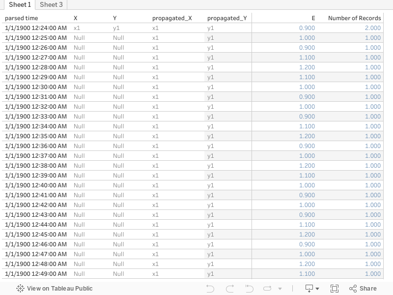
Note how there are two Measure Names and two Measure values, the italics ones are automatically generated, the non italic are fields in the clipboard source, string for the names and number for the measures. So now we have our pivoted field name and field value, and can use calculated fields to restore the dates to a date format as well as recreate our increment calculation
DATE(dateparse('ddMMyyyy',str([Measure Values])))

if [Measure Names]='start' then 1 elseif [Measure Names]='end' then -1 end

Finally here's the workbook:

Monday, 9 January 2017

Using the pivot with contracts

2018.1 Update

The contracts dummy data is quite typical of certain troublesome datasets, so I will demonstrate some less boring uses for it.

The Gantt chart is great for visualising but not very useful for doing any further calculations. With this sort of dataset to go any further you need to select the start and end dates and pivot.
The result of the pivot is to put all the dates in the same column, and add a second column telling you whether they are a start or an end date.
So now we can visualise both start and end without a calculated field as they are both on the same date axis. Much more useful though is the following calculated field which I'll call 'increment':
if [Pivot Field Names]='Start Date' then 1 elseif [Pivot Field Names]='End Date' then -1 end
A running sum of increment tells us at any given point the number of 'live' simultaneous contracts.

So finally, here's the visualisation: