Showing posts with label geographic role. Show all posts

Friday, 9 August 2019

Extracting the list of coordinates for geographic role 'airport' out of Tableau

Don't they say a picture is a thousand words? All you have to do is navigate to 
C:\Program Files\Tableau\Tableau Public 2019.2\local\data
(modify appropriately for Tableau desktop). Copy the airport tableau source and the GEOCODING database into another folder, drag and drop the tds on tableau and voila, you have the airports and their coordinates! You can even export them to csv for general purpose use.


Tuesday, 17 July 2018

Using Post code Sector GeoJson from TableauMapping.bi

Ok, so this time I'm using https://www.tableaumapping.bi/ properly. I connect using the web connector from tableau Public to https://www.tableaumapping.bi/wdc and chose the Post code Sector table. I then blend in my own data with post code addresses. I use a calculated field to generate the sector from the full post code in my data:
left([postcode],len([postcode])-2) 
and voila! a much more detailed map than the one I got before using only the first half of the postcode.

Monday, 16 July 2018

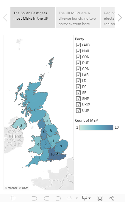
British MEPs go NUTS

I know what you are thinking, the European Parliament has more than its fair share of nutcases but this is about NUTS as in Nomenclature des unités territoriales statistiques  which are defined across Europe, but we'll take the UK as a case study.

A year and a half ago I looked into grouping counties and unitary authorities together in Tableau to form the European election constituencies in England. This takes a fair amount of work, and I had a dodgy solution with dual axis to avoid having to also group all Scottish, Welsh and Northern Irish counties in a similar way.

A much simpler solution using the latest Tableau functionality is to use NUTS as geographic role. This avoids needing a source to define the constituencies at all, so the data source of the MEPs of each region is enough to also generate maps.

Saturday, 7 July 2018

Splitting the prefix out of a british postcode with no spaces

I came across a dataset this week that had postcodes in this format
Tableau only understands the first half of the postcode, but how do we split it out? Wikipedia as always has a fairly comprehensive description: The outward code (i.e first half) can be from 2 to four characters, but the inward code (second half) is always three characters. Therefore we can isolate the outward code with a calculation:
left([Post Code],len([Post Code])-3)
This now gives the outward code alone in a field that can be given a post code geographic role and  used with the filled map mark type.
And if you do spatial analysis, that little anomaly on the river Thames would have caught your attention. Lets add place names and streets in the map layers and zoom in:

Friday, 1 June 2018

Layering filled maps and polygons on map (2018.1 update)

I wrote about this technique more than a year ago and it was one of my more popular posts, thanks to a tweet by zen master Chris Love. It is time to update the particular example as version 2018.1 finally brings generated Latitude and Longitude closer to Latitude and Longitude already in the dataset.

We start by UNIONing our two sources, the polygon source having latitude and longitude, the mark source having a field that can be interpreted as a filled map.

 We then use the new trick of putting generated latitude and longitude on the axis, with source latitude longitude in the level of detail for the polygon layer. In the past I would import the filled map source, generate the latitudes longitudes, export crosstab to excel, save as csv, and do a union with the polygon csv. No longer necessary as of 2018.1.
Now all that is required is dual axis to overlay the polygon over the filled map.

Tuesday, 29 May 2018

Labelling polygons that go across the prime meridian and its antimeridian


Consider a dataset describing polygons like the one below:

lat lon path polygons
1 1 1 1
-1 1 2 1
-1 -1 3 1
1 -1 4 1
1 1 5 1
1 179 1 2
-1 179 2 2
-1 -179 3 2
1 -179 4 2
1 179 5 2

Tableau doesn't allow you to label polygons directly, therefore the work around is to do dual axis on either latitude or longitude, and create a second layer using the average latitude and longitude of all the vertices of the polygon (key detail, remove the path from the level of detail, while you need it there for the polygon layer) to place the label. 

This works fine apart from any polygons that include points on either side of the antimeridian at 180 degrees longitude, using the convention of 0 to 180 for longitude east, and 0 to -180 for longitude west. The trick here is to detect if the maximum and minimum longitude have different signs and if difference between the maximum and the minimum longitude defines an angle smaller or greater than 180 degrees. In the latter case, the longitude convention needs to be changed to 0 to 360 for the averaging to give sensible results. To achieve that we create a calculated field as shown below and use it in place of the longitude.

if max([Lon])*min([Lon])<0 then
if max([Lon])-min([Lon])>180 then avg(if [Lon]<0 then 360+[Lon] else [Lon] end)
else avg([Lon]) end
else avg([Lon])
end

Sunday, 27 May 2018

Spatial filtering by distance in km from a known point


 Tableau has supported the circular select tool for a few versions now. So the lazy way out is to use this select option, click at the known point on the map and then drag watching the radius of the circle until it reaches the desired value (tip: change the workbook locale to English Ireland for it to be in kilometres rather than miles). This only works for small distances though, what if you want to be a zoom level further out and look at hundreds and thousands of kilometres, or even use this distance to do something else such as filtering?

Let's port the haversine formula into Tableau

Assuming our fixed point is at 52N 0E (consider using parameters with lists of values if you have several points of interest), we create a calculated field step_1:

sin(radians(52-[Latitude])/2) * sin(radians(52-[Latitude])/2) +
        cos(radians([Latitude])) * cos(radians(52)) *
        sin(radians(0-[Longitude])/2) * sin(radians(0-[Longitude])/2)

Then the distance in km from the point defined in step 1 is given by:

2*[R] * atan2(sqrt([step_1]), sqrt(1-[step_1]))

Where R has been defined as the radius of the earth in km: 6371.


Sunday, 20 August 2017

Tableau and negative zero

Another saga from the big data frontier: at work we have a source of GPS data, and I've been working with a colleague to aggregate it to a degree grid, not unlike the example linked. The data is in hive, and bizarrely it has two columns for each dimension, latitude magnitude as a positive float, and latitude sense as a string (N or S) etc. for longitude. To make our life simple we round the magnitude in the custom SQL that connects to hive, and we make the data signed again with a simple calculation in the Tableau source:
[round Latitude magnitude]*
(case [latitude sense]when 'S' then -1
when 'N' then 1
end)
The rounding of the magnitude is fine as we also keep the sense in the group by dimensions in the custom SQL. The only special case here is when the rounded magnitude is zero, where had we done the sign assignment before the rounding, we'd have one bucket for zero instead of one for 0-0.5 and one for -0.5-0. But surely that shouldn't be an issue once we do the calculation above in tableau?

It turns out that it is an issue. I'm not sure what's happening in the data engine (two's complement going crazy because of negative zero?) but the two zeros are treated differently, recreated with the data of the post linked above.
 Sure enough, looking at the two zeros there's one for -0 and one for +0. So we refine our calculation to avoid multiplying zero by -1

if [round Longitude magnitude]=0 then 0 else
[round Longitude magnitude]*
(case [longitude sense]
when 'W' then -1
when 'E' then 1
end)
end 

Sunday, 26 February 2017

Layering marks and polygons on map

This is a trick that has become much simpler to perform since the introduction of union in Tableau 9.3.

We start with two data files, one with the vertices of our polygons and another with the locations where we want the marks. We create a union of those two when we create our tableau data source.
the wildcard union is particularly handy for multiple files so keep it in mind, in this case we don't really need it. What we then need to do is select the Latitude and the lat columns, right click and select 'Merge mismatched fields', likewise for the longitudes.

Then we can create our map with these merged latitudes and longitudes, but we really want to create two maps, one for each layer. Here's how to create the marks map:
Beware of the averaged coordinates, if you don't put all the dimensions in the level of detail you might not get a mark for each row in your dataset! And here's how to create the polygon:

Now we need to select dual axis and right click and hide the 'Null' location.This will give us the desired two layer map.

As it happens, my marks are the centroids of post-codes. So we can tell tableau that through the geographic role of the location field, and select filled maps as the type of mark to get the postcode polygon instead of the dot at the centroid. Note that the (generated) Latitude and Longitude is no good for this as it is not visible when editing the source and cannot be merged with the mismatched latitude longitude of the polygon source after the union, they can't even be used in calculated fields which could be another way round (the pre-9.3 way of doing things). So an original text only source might have to be imported into tableau and the generated coordinates will have to be copied to a new source to use for a union.


Friday, 24 February 2017

Alternative maps

Don't get me wrong. I don't read defense magazines. The extracts below are from the Radio User magazine, that I used to get both from a professional interest in maritime and aero communications and a hobby interest in shortwave and medium wave listening ( DX-ing). It is an excellent source of information on ADS-B and AIS as well as general search and rescue and safety comms, and of course long distance broadcasting and propagation conditions.

It does however also cater for plane spotters and scanner enthusiast following military exercises, hence the 'alternative' map of Scandinavia below. The description of the made up fringe country between Norway and Iceland is hilarious, any similarities to Brexit island are purely coincidental


The challenge as always of course is how to re-make the map in Tableau. To make my life easier I'm ignoring the made up internal borders inside Sweden and Finland, and focusing on relocating New Zealand to the North Atlantic.

Lets start with a dataset listing the necessary countries. Tableau is very good at mapping them in their usual locations.


But how do we move New Zealand? Let's have a go extracting the generated coordinates and fiddling with the numbers. We select the countries on the map, view the data and it's a rare case that the summary has more info (generated coordinates) than the full data. Select everything and copy into the csv creator of choise, any spreadsheet application will do.

Now move New Zealand to its 'alternative' position, lets say 60N 5W, remove the (generated) from the header, save the csv and re-import into Tableau.If you put the new coordinates on X and Y you get dots at the right places. But change to a filled map and New Zealand stubbornly refuses to move from the Pacific to the Atlantic.

Ok so clearly Tableau is doing things behind the scenes. Of course it has to as we haven't specified the relative size of the countries. Let's do that by adding the area of each country in another column. So can we escape by setting the geographic role to 'None'? 


It has flattened Norway, so it is sort of re-projecting the shape from Mercator projection. But everything is in the wrong place, and we've pushed the size as far up as possible. Bear in mind that we have another weapon in our disposal, zooming. Tableau doesn't zoom into the marks at the same magnification levels that it zooms into a map. You can see this by zooming into my Makeover Sunday II map. In this case, we want to zoom out to see if it gels the countries together. 


So it's not that simple. At this point we give up and leave it for another day.

Wednesday, 1 February 2017

Mapping the UK regions

For a more up to date and simpler approach see a later post using NUTS geographic role. Both grouping filled map areas and dual axis maps are very worthwhile techniques so I feel this tutorial is still useful.

In this post I'll guide you through making the maps used in the visualisation of UK MEPs I published last time.

For our raw data we turn to wikipedia's Regions of England. Following the link for each region we go to the 'Local government' part, where we copy the table into Excel.
 Tableau knows the 'County/Unitary' field, once you clean it up a bit and give it county as the geographic role. This is with the exception of the starred fields above (e.g. Greater Manchester and Merseyside) where tableau knows the metropolitan boroughs, not the metropolitan country, so you have to break it to separate rows for each borough. In tableau you then will get the map below:
Group the unitary authorities/counties/boroughs to regions, and use that in place of the county in level of detail. This gives us the maps of England, but what about Scotland, Wales and Northern Ireland?

You could go and find all the counties etc. there, but there is a much simpler way. Add Scotland, Wales and Northern Ireland rows with the names in the same field as the names of english counties. Then duplicate the field in Tableau and this time change geographic role to State/Province. Then drag Longitude (generated) next to the already existing Longitude (generated) for columns, and change the level of detail of the map to this State/Province field. You should get two maps next to each other:
Now all you need to do is click on the Longitude and select dual axis and voila! a map with the UK regions. Don't worry too much about the 121 unknown, it should be all the counties/authorities/boroughs that didn't match 'England' and are not shown on the map on the left, plus the 3 States/Provinces that didn't match a county name and are not shown on the map to the right. As long as you have no gaps in the dual axis map you should be fine.

The dual axis does cause a number of weird behaviours. E.g. right click on the sheet, select 'Duplicate as Crosstab' and you get two new sheets, one crosstab for each map. So for some applications you might want to avoid dual axis, and list all the counties of Wales, Scotland and Northern Ireland instead.

Sunday, 29 January 2017

Mapping the UK's members of the European parliament

How to tutorials on mapping UK regions and blending MEP data to UK regions map.

After a bit of copy paste from online sources, I created a list of UK MEPs, and a list of local authorities in England as well as the 3 devolved administrations of Scotland, Wales and Northern Ireland, which I used for the visualisation below. I will revisit this in future posts for a detailed 'how to'. For the moment I'd like to draw your attention to the fact that any statistics here are based on the number of elected MEPs of each party in each region, and not the actual votes counted.

 I devise a numerical scale to map parties left to right, which is by its very nature arbitrary, and specific to the time (2014) and place (i.e. a UK definition of centre right can be quite different from a French one). I thought it was fair enough to put Lib Dems in the centre after their coalition time, and Labour and Conservatives (including the Ulster Unionists) on either side, with UKIP further right, the regional parties and greens on the left, and the two main parties of Northern Ireland defining far left and far right. Averaging this numerical value of the MEPs of a particular region is used to place it on the Left-Right spectrum, though a closer look at similar scoring regions shows vast differences that can be summarised by the same statistics!


Wednesday, 18 January 2017

Με αφορμή τις Δημοτικές Εκλογές του 2016

Where Stelios looks at some open data from local elections in Cyprus, and Tableau doesn't do very well mapping districts and local authorities in Cyprus, even when using post codes or groups of post codes.

Το ιστολόγιο παίζει σε δύο ταμπλώ γλωσσικά, θεματολογικά και άλλως πως, που ελάλεν τζιαι η φιλόλογος μου. Στον ελληνοκυπριακό τομέα 😛 κοιτάζουμε τι λέει η Κυπριακή Δημοκρατία από ανοιχτά δεδομένα, χαρτογραφούμε κυπριακά δεδομένα κλπ.

Για να ασχολήθουμε με την πρόσφατη επικαιρότητα, ας κοιτάξουμε τα αποτελέσματα των εκλογών τοπικής αυτοδιοίκησης . Πάνω δεξιά στην ιστοσελίδα υπάρχει ένα εικονίδιο zip για κατέβασμα των αποτελεσμάτων. Τα περιεχόμενα έχουν ένα θέμα με την κωδικοποίηση, τουλάχιστο στα Windows.
Τα αρχεία τουλάχιστον είναι χρησιμοποιήσιμα. Ο πρώτος φάκελος περιέχει τους δήμαρχους σε αρχείο τύπου .xls συν συγκεντρωτικά και αναλυτικά αποτελέσματα σε δύο αρχεία κειμένου .txt

Στο αρχείο με τους δήμαρχους κάτι πάει λάθος με τις επικεφαλίδες.


Η στήλη με τους δήμους περιέχει τες επαρχίες, η στήλη με τις επαρχίες αντίστοιχα περιέχει τους δήμους. Μικρόν το κακό. Ο υπέρτιτλος θα ήταν πρόβλημα με παλιότερες εκδόσεις του tableau αλλά όχι πλέον. Ττικκάρουμε την επιλογή 'use data interpreter':

Μετά ξεκινούμε τη χαρτογράφηση. Μετονομάζουμε τη στήλη Δήμος σε επαρχία, την στήλη επαρχία σε δήμος. Επιλέγουμε για την επαρχία γεωγραφικό ρόλο 'State Province'. Αντιστοιχούμε τα ελληνικά στα αγγλικά ονόματα των επαρχιών επιλέγοντας την Κύπρο σαν χώρα.
Τα πολύγωνα των επαρχιών (marks -> filled map) εν αρκετά χοντροκομμένα, η βάση Ακρωτηρίου μινήσκει εκτός επαρχίας Λεμεσού ενώ ολόκληρη η βάση Δεκέλειας πάει στην επαρχία Αμμοχώστου, ο Απόστολος Αντρέας εν ομοσπονδιακό πάρκο 😀 έξω που την επαρχία Αμμοχώστου.


Αναλόγως καλά σε σχέση με τη χαρτογράφηση των δήμων. Ο γεωγραφικός ρόλος 'City'  ξέρει μόνο τις πρωτεύουσες των επαρχιών συν τον Πρωταρά (???) ενώ μόνο η Λευκωσία αναγνωρίζεται στα ελληνικά. 

Η άλλη επιλογή είναι ο γεωγραφικός ρόλος 'Zip Code/Post Code'. Οι επιλογές είναι μόνο τα πρώτα δύο ψηφία του κώδικα
Σε χάρτη οι κώδικες εν κάπως έτσι:

Στην πράξη πάλε δε γίνεται τίποτε γιατί υπάρχουν περιπτώσεις που 2 δήμοι έχουν τα ίδια πρώτα 2 ψηφία ταχυδρομικού κώδικα, π.χ. Γερμασόγεια-Μέσα Γειτονιά. 

Ο ταχυδρομικός κώδικας μπορεί να χρησιμοποιηθεί για δημιουργία πολυγώνων μεγαλύτερης ακρίβειας για τις επαρχίες, ομαδοποιώντας τους κώδικες της κάθε επαρχίας (νέα πατέντα του tableau 10). Δυστυχώς η πράσινη γραμμή είναι εκτός του πολύγωνου, με αρκετά ακαλαίσθητο αποτέλεσμα. Ολόκληρη η απαγκιστρωμένη ζώνη, Τρούλλοι, Αθηένου κλπ φαίνεται σαν να είναι εκτός ταχυδρομικού κώδικα.