
Showing posts with label calculated fields. Show all posts
Showing posts with label calculated fields. Show all posts
Wednesday, 14 August 2019
Distinct count of countries VS count of Countries

Sunday, 30 June 2019
Workarounds for getting new 2019.3 features in earlier versions
The 2019.3 beta is out and here's the list of new features. It's nice of Tableau to automate some of the things that could be done with workarounds in previous versions. If you like the new features but are stuck in an old version, or if you are a new kid wanting to know how things were done in ye olden days, follow the links below:
Distance between two points as a calculation
Working with data in UK national grid projected coordinates (haven't tried this script in TabPy to see how slow it would be, worked fine as a standalone python script for data preprocessing)
Pdf subscriptions (courtesy of Interworks)
Distance between two points as a calculation
Working with data in UK national grid projected coordinates (haven't tried this script in TabPy to see how slow it would be, worked fine as a standalone python script for data preprocessing)
Pdf subscriptions (courtesy of Interworks)
Tuesday, 17 July 2018
Using Post code Sector GeoJson from TableauMapping.bi
Ok, so this time I'm using https://www.tableaumapping.bi/ properly. I connect using the web connector from tableau Public to https://www.tableaumapping.bi/wdc and chose the Post code Sector table. I then blend in my own data with post code addresses. I use a calculated field to generate the sector from the full post code in my data:

left([postcode],len([postcode])-2)and voila! a much more detailed map than the one I got before using only the first half of the postcode.

Saturday, 7 July 2018
Splitting the prefix out of a british postcode with no spaces
I came across a dataset this week that had postcodes in this format


Tableau only understands the first half of the postcode, but how do we split it out? Wikipedia as always has a fairly comprehensive description: The outward code (i.e first half) can be from 2 to four characters, but the inward code (second half) is always three characters. Therefore we can isolate the outward code with a calculation:
left([Post Code],len([Post Code])-3)
This now gives the outward code alone in a field that can be given a post code geographic role and used with the filled map mark type.

And if you do spatial analysis, that little anomaly on the river Thames would have caught your attention. Lets add place names and streets in the map layers and zoom in:

Tuesday, 29 May 2018
Labelling polygons that go across the prime meridian and its antimeridian
Consider a dataset describing polygons like the one below:
| lat | lon | path | polygons |
| 1 | 1 | 1 | 1 |
| -1 | 1 | 2 | 1 |
| -1 | -1 | 3 | 1 |
| 1 | -1 | 4 | 1 |
| 1 | 1 | 5 | 1 |
| 1 | 179 | 1 | 2 |
| -1 | 179 | 2 | 2 |
| -1 | -179 | 3 | 2 |
| 1 | -179 | 4 | 2 |
| 1 | 179 | 5 | 2 |
Tableau doesn't allow you to label polygons directly, therefore the work around is to do dual axis on either latitude or longitude, and create a second layer using the average latitude and longitude of all the vertices of the polygon (key detail, remove the path from the level of detail, while you need it there for the polygon layer) to place the label.

This works fine apart from any polygons that include points on either side of the antimeridian at 180 degrees longitude, using the convention of 0 to 180 for longitude east, and 0 to -180 for longitude west. The trick here is to detect if the maximum and minimum longitude have different signs and if difference between the maximum and the minimum longitude defines an angle smaller or greater than 180 degrees. In the latter case, the longitude convention needs to be changed to 0 to 360 for the averaging to give sensible results. To achieve that we create a calculated field as shown below and use it in place of the longitude.
if max([Lon])*min([Lon])<0 then
if max([Lon])-min([Lon])>180 then avg(if [Lon]<0 then
360+[Lon] else [Lon] end)
else avg([Lon]) end
else avg([Lon])
end
Sunday, 27 May 2018
Spatial filtering by distance in km from a known point
Tableau has supported the circular select tool for a few versions now. So the lazy way out is to use this select option, click at the known point on the map and then drag watching the radius of the circle until it reaches the desired value (tip: change the workbook locale to English Ireland for it to be in kilometres rather than miles). This only works for small distances though, what if you want to be a zoom level further out and look at hundreds and thousands of kilometres, or even use this distance to do something else such as filtering?
Let's port the haversine formula into Tableau
Let's port the haversine formula into Tableau
Assuming our fixed point is at 52N 0E (consider using parameters with lists of values if you have several points of interest), we create a calculated field step_1:
sin(radians(52-[Latitude])/2) *
sin(radians(52-[Latitude])/2) +
cos(radians([Latitude])) * cos(radians(52)) *
sin(radians(0-[Longitude])/2) * sin(radians(0-[Longitude])/2)
Then the distance in km from the point defined in step 1 is given by:
2*[R] *
atan2(sqrt([step_1]), sqrt(1-[step_1]))
Where R has been defined as the radius of the earth in km: 6371.
Sunday, 26 November 2017
Colouring by secondary source dimension in Tableau, avoiding the asterisk
So we have two sources, the primary one lists European election constituency regions per UK nation. The secondary one lists all the MEPs with their region and party

So, how do we blend those two, and do a bar chart of the MEPs of each region with the appropriate party colour coding?

There is a work around, but it only works for cases like this where there is a handful of Parties. We create a separate calculated field for each party's MEP, and use measure names on colour, and throw all these party MEP calculated fields on measure values (see screenshot above, calculations below)
if [Party]='CON' or [Party]='UUP' then [MEP] end
if [Party]='LAB' then [MEP] end
if [Party]='UKIP' then [MEP] end
if [Party]='SNP' then [MEP] end
if [Party]!='SNP' and [Party]!='CON' and[Party]!='LAB' and [Party]!='UUP' and [Party]!='UKIP' then [MEP] endI've given a different scenario of avoiding the asterisk with calculated fields in a blend in a previous post here
Saturday, 25 November 2017
Converting hexadecimal values in Tableau
While Tableau has a lot of basic maths and string functions, coping with hexadecimal numbers is not something it can do natively. Let's see how we can do this with calculated fields.
To make the solution easier we break the problem into two: Interpret each hexadecimal digit, and then put the results together to convert the whole number to decimal. We create a calculated field for the rightmost hex digit (1s)
To make the solution easier we break the problem into two: Interpret each hexadecimal digit, and then put the results together to convert the whole number to decimal. We create a calculated field for the rightmost hex digit (1s)
We do the same for the next digit (16s) where we can use mid([Hex No],5,1) assuming our numbers are in the format 0x023c. Likewise for the next two digits, 16^2s and 16^3s. Then we bring everything together:ifnull(int(right([Hex No],1)),case right([Hex No],1)when 'a' then 10when 'b' then 11when 'c' then 12when 'd' then 13when 'e' then 14when 'f' then 15end)
[16^3s]*16*16*16+[16^2s]*16*16+[16s]*16+[1s]
Sunday, 22 October 2017
Work around for problems with Split function when connecting Tableau to PostgreSQL
I'm a big fan of the split function when doing calculated fields. Partly because far too often, the fields from the sources I work with are concatenations of other fields, or even because I've done a union of several CSV sources and some crucial bit of information is hidden in the table name/path. But recently I tried to use this with PostgreSQL and I got the following error
- ERROR: function split_part(text[], unknown, integer) does not exist; Error while executing the query
mid([concat_str],start_of_split, find([concat_str],'/',start_of_split)-start_of_split)where start_of_split is a fixed number of characters (maybe you want to do another find here) and '/' defines the delimiter to use when splitting.
Sunday, 20 August 2017
Tableau and negative zero
Another saga from the big data frontier: at work we have a source of GPS data, and I've been working with a colleague to aggregate it to a degree grid, not unlike the example linked. The data is in hive, and bizarrely it has two columns for each dimension, latitude magnitude as a positive float, and latitude sense as a string (N or S) etc. for longitude. To make our life simple we round the magnitude in the custom SQL that connects to hive, and we make the data signed again with a simple calculation in the Tableau source:
It turns out that it is an issue. I'm not sure what's happening in the data engine (two's complement going crazy because of negative zero?) but the two zeros are treated differently, recreated with the data of the post linked above.
 Sure enough, looking at the two zeros there's one for -0 and one for +0. So we refine our calculation to avoid multiplying zero by -1
[round Latitude magnitude]*The rounding of the magnitude is fine as we also keep the sense in the group by dimensions in the custom SQL. The only special case here is when the rounded magnitude is zero, where had we done the sign assignment before the rounding, we'd have one bucket for zero instead of one for 0-0.5 and one for -0.5-0. But surely that shouldn't be an issue once we do the calculation above in tableau?
(case [latitude sense]when 'S' then -1
when 'N' then 1
end)
It turns out that it is an issue. I'm not sure what's happening in the data engine (two's complement going crazy because of negative zero?) but the two zeros are treated differently, recreated with the data of the post linked above.

if [round Longitude magnitude]=0 then 0 else
[round Longitude magnitude]*
(case [longitude sense]
when 'W' then -1
when 'E' then 1
end)
end
Tuesday, 28 March 2017
Statistics of statistics
In looking at the pie charts of CPD hours we found that the sum of averages was the average of the sums, whereas the sum of medians was much smaller than the median of the sums. This is another way of saying that the average is a linear function, i.e. it is true that
f(ax+by)=af(x)+bf(y)whereas the median is non linear. This is quite important from a visualisation point of view as pie charts, stacked bar charts, area graphs etc. imply that the sum of the parts is a meaningful quantity, and in the case of non linear aggregations (median, countd) often it isn’t.
In tables Tableau addresses this with ‘grand total’, the aggregation for which doesn’t have to be a sum but could be e.g. an overall median. If you’ve been careful to never imply the parts can be summed but still find your users exporting data and doing sums in excel, adding a table view with a grand total configured to the suitable aggregation can save you from hours of arguing!
Another case of statistics of statistics in Tableau can arise when using Level of Detail Calculations. I used to do this manually by doing counts at ‘exact date’ level of detail, exporting the counts to excel, re-importing the counts to tableau and then finding the weekly maximum of the counts, effectively using Tableau as my data warehouse/ETL tool as well as the analysis and visualisation tool. The emergence of Level of Detail calculations saved me from all this bother, as now I could plot a
max({fixed [date]:count([x])})against the date to the nearest week.
Of course there are also cases of using data from a proper data warehouse, whether the traditional RDBMS one or Hive. In that case again it is worth being careful to match any aggregation done in Tableau to the aggregation done in the data warehouse. e.g Min([min_x])can’t go wrong, but the averages can be a bit tricky. Say the original SQL was
SELECT avg(x) AS avg_x GROUP BY dwhere d1 has 1 record and d2 has 100! Coming then in Tableau to do an avg([avg_x]) is just asking for trouble. Instead modify the SQL to
SELECT avg(x) AS avg_x, count(1) AS n GROUP BY dand then we can get the proper average in Tableau with
SUM([avg_x]*[n])/SUM([n])
Sunday, 26 February 2017
Layering marks and polygons on map
This is a trick that has become much simpler to perform since the introduction of union in Tableau 9.3.
We start with two data files, one with the vertices of our polygons and another with the locations where we want the marks. We create a union of those two when we create our tableau data source.
 the wildcard union is particularly handy for multiple files so keep it in mind, in this case we don't really need it. What we then need to do is select the Latitude and the lat columns, right click and select 'Merge mismatched fields', likewise for the longitudes.

Then we can create our map with these merged latitudes and longitudes, but we really want to create two maps, one for each layer. Here's how to create the marks map:
 Beware of the averaged coordinates, if you don't put all the dimensions in the level of detail you might not get a mark for each row in your dataset! And here's how to create the polygon:

Now we need to select dual axis and right click and hide the 'Null' location.This will give us the desired two layer map.
 As it happens, my marks are the centroids of post-codes. So we can tell tableau that through the geographic role of the location field, and select filled maps as the type of mark to get the postcode polygon instead of the dot at the centroid. Note that the (generated) Latitude and Longitude is no good for this as it is not visible when editing the source and cannot be merged with the mismatched latitude longitude of the polygon source after the union, they can't even be used in calculated fields which could be another way round (the pre-9.3 way of doing things). So an original text only source might have to be imported into tableau and the generated coordinates will have to be copied to a new source to use for a union.

We start with two data files, one with the vertices of our polygons and another with the locations where we want the marks. We create a union of those two when we create our tableau data source.


Then we can create our map with these merged latitudes and longitudes, but we really want to create two maps, one for each layer. Here's how to create the marks map:


Now we need to select dual axis and right click and hide the 'Null' location.This will give us the desired two layer map.


Thursday, 23 February 2017
Re-Make Thursday
Not a makeover this time but a re-make. The data comes from my local council: They collect the recycling and the rubbish on alternate weeks, and because the collection day is a Monday, it gets collected later in the week when there are bank holidays. The colour scheme they selected is very sensible: colour by bin colour, stronger colours for the weeks when the collection happens later because of bank holidays.
I thought I could do it with a calculated field that calculates odd and even weeks
So we have to colour by a continuous variable, and counter-intuitively, the dark colours are at the two ends and the light colours in the middle. The mark is square and the label is the date.

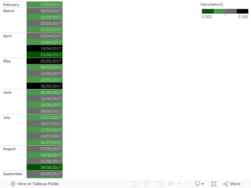
I thought I could do it with a calculated field that calculates odd and even weeks
float(DATEPART( 'week', [Collection Days])/2 - int(DATEPART( 'week', [Collection Days])/2))and colour by that and by whether it's Monday or not
DATEPART('weekday', [Collection Days])=2However, the coloured box with text in it only works if the colour is driven by a continuous variable, rather than by a discrete one (or a discrete and a boolean, as in my original plan).
So we have to colour by a continuous variable, and counter-intuitively, the dark colours are at the two ends and the light colours in the middle. The mark is square and the label is the date.
if [odd even week]=0 and not [Monday?] then 0.0 elseif [odd even week]=0 and [Monday?] then 1.0 elseif [odd even week]=0.5 and [Monday?] then 2.0 elseif [odd even week]=0.5 and not [Monday?] then 3.0 end

Sunday, 12 February 2017
Makeover Sunday II
This time I'm using a dataset from Jamie Laird, original workbook on Tableau Public . Having worked in remote sensing before, I like the idea of a map as pixels of so many kilometres by so many kilometres, or so many degrees by so many degrees latitude and longitude. This dataset behaves well with Tableau's default Mercator projection(only projection using built in maps) . If you have data closer to the poles you might want to force a geographic projection by using your own map background image.
As always, a couple of calculated fields come handy.
Truncated Latitude and Longitude:

As always, a couple of calculated fields come handy.
Truncated Latitude and Longitude:
int([Latitude])
int([Longitude])Aggregate the number of responses and force a logarithmic colour scale, with appropriate legend:
case int(log(COUNTD([Response ID])))
when 0 then '<10'
when 1 then '10<x<100'
when 2 then '100<x<1000'
when 3 then '>1000'
end
Some footnotes on presentation: make sure you have no border or halo on the marks (controlled through colour), and if you really want to treat the marks as individual pixels use the square mark type.
Sunday, 5 February 2017
Blending MEP data to UK regions map
This part 3 of my MEP analysis: after presenting the Tableau visualisation and discussing the creation of the map, I look into using the list of all UK MEPs as a secondary datasource blended with the map.
Counting the MEPs per English region is the easier case. Region is the linking field, and we can filter on a field from the secondary source (Party) with no problem, as we are using a simple aggregation, the count (CNT). For Scotland etc. the added complication is having to link on the devolved administration which we throw into the level of detail of the relevant 'Latitude (generated)' mark.

I mentioned that the count is a simple aggregation, other similar aggregations that 'tolerate' filters from secondary sources are SUM and AVG. Things get trickier when trying to look at parties, as we have to use the distinct count. We only want to count a party once in each region it occurs in, not once for every MEP.
 So how do we filter, e.g. for regional vs. UK wide parties? This is a classic case were a parameter is necessary. We right click at the bottom left, choose 'Create Parameter' and give the options we want in the menu:
 Then we also create a (lower case) party calculated field driven by the parameter and we use the distinct count of this calculated field for the label and the colour:
 This deals with one major issue with using secondary sources. Now let's consider another one. We've grouped our parties by regional and UK wide appeal, and we don't want to filter, but we want the tooltip to tell us what party appeal MEPs a region has as we hover over the map with the mouse. Tableau likes to aggregate anything coming from the secondary source along the linking dimensions, so it will aggregate the appeal of parties of each region, and the default aggregation for a string is ATTR(). This is perfectly fine in England where no regional parties get elected, it will return 'UK wide'. But what about the devolved administrations where regional and UK wide parties are both represented? There's a dirty hack, and as usual it involves a calculated field.
Counting the MEPs per English region is the easier case. Region is the linking field, and we can filter on a field from the secondary source (Party) with no problem, as we are using a simple aggregation, the count (CNT). For Scotland etc. the added complication is having to link on the devolved administration which we throw into the level of detail of the relevant 'Latitude (generated)' mark.

I mentioned that the count is a simple aggregation, other similar aggregations that 'tolerate' filters from secondary sources are SUM and AVG. Things get trickier when trying to look at parties, as we have to use the distinct count. We only want to count a party once in each region it occurs in, not once for every MEP.


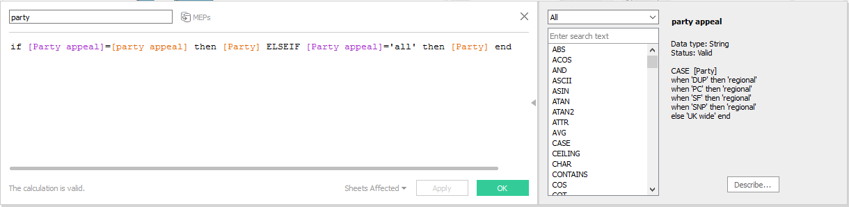
min([party appeal])+(if max([party appeal])!=min([party appeal]) then ' & '+MAX([party appeal]) else '' end)MIN and MAX on strings is fine when there are only two options like in this case, so now instead of the hated '*' our devolved regions return 'UK wide & regional'. If we were dealing with a string field that had more than two values, MIN and MAX could still be useful to return an 'a-z' type range, if applicable. If it gets too complicated, maybe a blend is seriously limiting the analysis and another approach should be followed.
Saturday, 21 January 2017
Aggregating and propagating field values across asynchronous sources
That was a title full of made up jargon, not even standard database/tableau jargon! Hopefully an example will make it clear.
First of all, what do I mean by asynchronous sources data? It is the sort of data that comes from multiple sources, not at the same times (often from separate files/tables, after a union). A screenshot as usual is worth a thousand words.
 In this example let's assume we have a ship that reports its GPS coordinates every half hour, and the energy consumption on board every minute (it's fitted with a smart meter!). But what if we want to come up with energy usage for each position? The easy solution is to come up with a calculated 'half hour time' that truncates the original timestamps to half hour

But what if the position is not consistently every half hour, what if it is less often when it moves slow, and more often when it moves fast? Then, assuming we still don't need to interpolate intermediate positions, we can avoid aggregation and instead try and fill in the null Xs and Ys using table calculations:

This is a more robust method for non-regular interval reports, we can even copy paste it into a new sheet as a clipboard source if the table calculations are an issue.
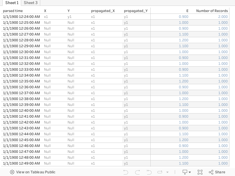
First of all, what do I mean by asynchronous sources data? It is the sort of data that comes from multiple sources, not at the same times (often from separate files/tables, after a union). A screenshot as usual is worth a thousand words.

left([Time],3)+if int(mid([Time],4,1))<3 then '00' else '30' endthrow that on the level of detail, the x and y on rows and columns, and sum(E) will do the right thing. All well and good. There's the issue of truncating rather than rounding the time, and not interpolating intermediate positions but let's assume that level of accuracy is not important for this.

But what if the position is not consistently every half hour, what if it is less often when it moves slow, and more often when it moves fast? Then, assuming we still don't need to interpolate intermediate positions, we can avoid aggregation and instead try and fill in the null Xs and Ys using table calculations:
ifnull(attr([X]),previous_value(attr([X])))
This is a more robust method for non-regular interval reports, we can even copy paste it into a new sheet as a clipboard source if the table calculations are an issue.
Today's quick fix
Faced with data looking like in the table below, a bit of calculated field magic does the trick as there is an implied stop date that is not always the same as the start date.
Date
|
Start
|
Stop
|
01/12/2016
|
01:30
|
03:00
|
15/12/2016
|
05:30
|
07:00
|
16/12/2016
|
12:00
|
15:30
|
28/12/2016
|
21:00
|
02:30
|
Start timestamp
dateparse('dd/MM/yyyy HH:mm',[Date]+' '+[Start])
Stop timestamp
dateparse('dd/MM/yyyy HH:mm',[Date]+' '+[Stop])+(if [Stop]<[Start] then 1 else 0 end)
Sunday, 8 January 2017
Makeover Sunday
This is the first of a series of three posts on the same data source, part II and part III
Hello world,
I've been a tableau user for a while now and finally decided to engage publicly and contribute back to the community.
Makeovers are a tradition in tableau blogging. I'm going to give them a slight twist: I'm not focusing on the look of the visualisation but more on what goes on under the hood. For the first makeover I'm taking inspiration from a recent post by Andre de Vries . Andre is showcasing an interesting new feature in tableau 10.2 , but he is using a join where not absolutely necessary. As is the case with joins, the resulting dataset has dimensions MxN where M and N the dimensions of the joined datasets.
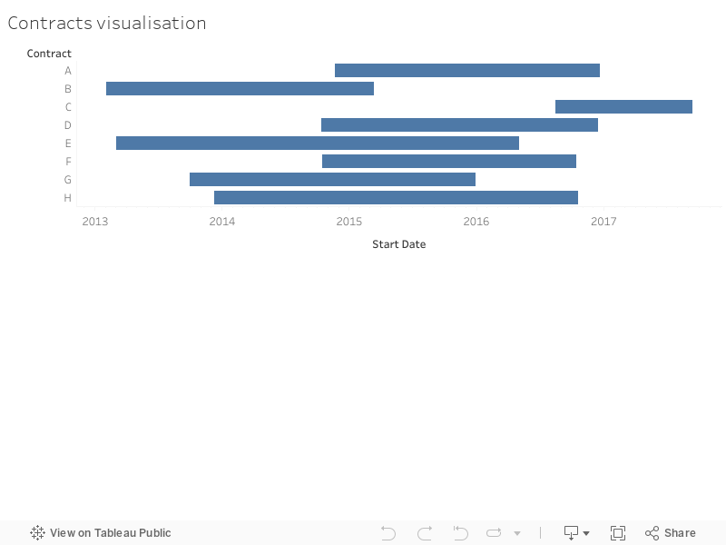
I recreated Andre's dummy contract data, and used a single calculated field:

Hello world,
I've been a tableau user for a while now and finally decided to engage publicly and contribute back to the community.
Makeovers are a tradition in tableau blogging. I'm going to give them a slight twist: I'm not focusing on the look of the visualisation but more on what goes on under the hood. For the first makeover I'm taking inspiration from a recent post by Andre de Vries . Andre is showcasing an interesting new feature in tableau 10.2 , but he is using a join where not absolutely necessary. As is the case with joins, the resulting dataset has dimensions MxN where M and N the dimensions of the joined datasets.
I recreated Andre's dummy contract data, and used a single calculated field:
Duration=End Date - Start DateThus after putting Contracts on Rows and Start Date on Columns (Detail: Exact Date), which Andre does 1:40 min into his video, I also put Duration on the size, which turns the whole thing into the intended Gantt chart.

Subscribe to:
Posts (Atom)