Showing posts with label Elections. Show all posts

Monday, 16 July 2018

British MEPs go NUTS

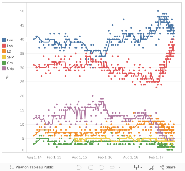
I know what you are thinking, the European Parliament has more than its fair share of nutcases but this is about NUTS as in Nomenclature des unités territoriales statistiques  which are defined across Europe, but we'll take the UK as a case study.

A year and a half ago I looked into grouping counties and unitary authorities together in Tableau to form the European election constituencies in England. This takes a fair amount of work, and I had a dodgy solution with dual axis to avoid having to also group all Scottish, Welsh and Northern Irish counties in a similar way.

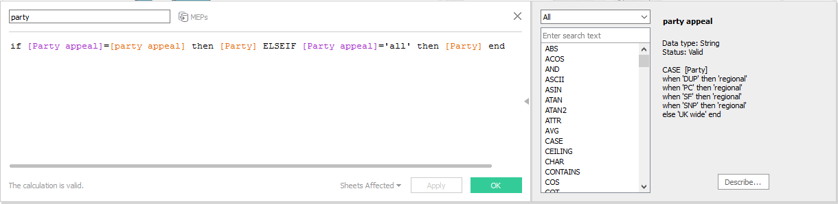
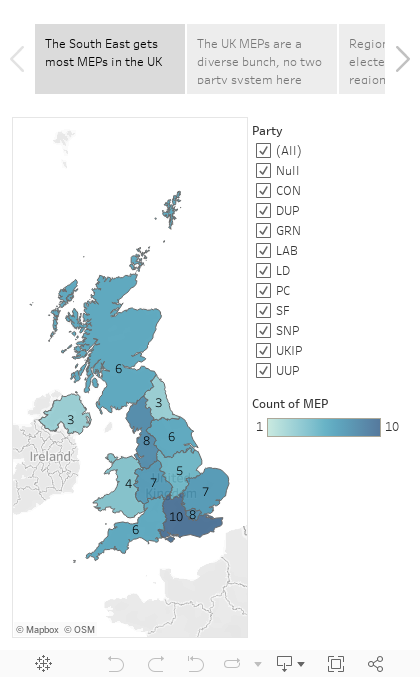
A much simpler solution using the latest Tableau functionality is to use NUTS as geographic role. This avoids needing a source to define the constituencies at all, so the data source of the MEPs of each region is enough to also generate maps.

Friday, 4 May 2018

BBC News website Carto election map epic fail

Meanwhile, in the land where elections happen on Thursdays, this is what happens to the public broadcaster website on the day after!


Sunday, 11 June 2017

Pollster pollster, what do you know?

It's been quite a while since I put something on Tableau public. Once I saw this I couldn't resist. I can't quite get the trend line right, but let that be an exercise for the reader :)


Saturday, 27 May 2017

A green electoral trend

The bar chart below, from Green party leaflets, is very interesting. The argument here is that the share of their vote is growing and voting for them is not a lost vote. I have a lot of sympathy for the argument for proportional representation. The 2015 British national election was a joke, with UKIP being a third party in votes but not in seats, and SNP benefiting massively from first past the post to get a monopoly of Scottish seats that is not quite reflected in the vote counts. 
However, this chart poses a few questions for me. Sure, the green vote grew from 2010 to 2015, but was it a one off that cannot be projected into further growth for 2017? 
After all 2015 was the fall of the LibDems, and those voters who felt betrayed by Clegg but hadn't forgiven Labour either could vote Green. The situation of course is very different now, with Labour breaking away entirely from the Blairite past while the LibDems are trying to capitalise on the 48% Remain vote (by repeating the Guardian quote 'Corbyn betrayed us' among other things).
An equally interesting feature of this bar chart is the plateau from 2005 to 2010, which supports the argument that 2015 was an outlier and not the manifestation of an underlying trend. Last decade had very different priorities to the current one; the two big parties had largely taken on-board environmental concerns, the Tories even had a green tree as a logo (the same one that was repainted with the union jack recently), and even though the economic crisis was obvious at the end of the decade, the political priorities took a while to change. So maybe 2010 is the outlier, and the trend is there.
We'll only know once the 2017 results are out!

Sunday, 14 May 2017

The Tory deficit

So, another month, another election campaign. Cambridge is a two horse race again, this time there is no dispute on which parties are the two horses, as in the little snippet I scanned from the latest LibDem leaflet. But what about that black arrow over the blue bar? That's what I call 'the Tory deficit'. Not the financial deficit but the one of votes. Or is it?
Let's think about this. The black arrow would bring the Cons up to about 34%. Then the total would be 34+35+36=105% and that's without counting the small parties. I'm also not convinced the bars start from zero, but it's quite hard to compare the length of the arrow against the length of the bars. 
In terms of electoral rhetoric, 'Jeremy Corybn's (sic) candidate' is an interesting choice. Julian Huppert very much lost in 2015 because he was 'Nick Clegg's candidate'. Of course the Liberals are pushing the argument a bit too much by saying (in a previous leaflet that went to recycling without stopping by the scanner) 'Don't vote Tory, you might get Corbyn! 
  

Saturday, 29 April 2017

Cambridgeshire and Peterborough is a two horse race

In the wider context of the cult of the leader/CTO, Cambridgeshire and the Peterborough unitary authority are bundled together for a devolved mayor election, with a budget for the mayor to tackle housing and transport. To her credit, the green candidate at least proposes forming an assembly to keep this leader in check, but there is little chance of a green mayor. Local election literature told us time and again that it's a two horse race. But which two horses?
Labour have been using the only previous result that covers the same geographical area with a similar electoral process, and helpfully, shows them as the only ones that can beat the tory. They also foolishly put it on their website in jpeg format, with discrete cosine transform artifacts and all. Next time please use png guys!
But the mayor would have important make or break powers on a number of important issues. Houses in Cambridge are about as overpriced as in London. A new train station has led to redevelopment and price hikes in formerly affordable Chesterton as developers prepare to house even more London commuters. Peterborough of course has been discussed in the national press in a number of 'this is why Brexit happened' articles. This election is likely to be taken far more seriously by voters than the police and crime commissioner one in 2016.
On the other hand, Lib Dems are doing something even worse, using the Cambridgeshire county council results that wouldn't include any Peterborough votes at all. After all they still have residual support in Cambridge from back in the day when they were the anti-war, anti-fees party to the left of New Labour, whereas in Peterborough the Tories are much stronger, and they are a distant third party.
For more close monitoring of election visualisations, see Phil Rodgers' blog  .

Sunday, 5 February 2017

Blending MEP data to UK regions map

This part 3 of my MEP analysis: after presenting the Tableau visualisation and discussing the creation of the map, I look into using the list of all UK MEPs as a secondary datasource blended with the map.
Counting the MEPs per English region is the easier case. Region is the linking field, and we can filter on a field from the secondary source (Party) with no problem, as we are using a simple aggregation, the count (CNT). For Scotland etc. the added complication is having to link on the devolved administration which we throw into the level of detail of the relevant 'Latitude (generated)' mark.


I mentioned that the count is a simple aggregation, other similar aggregations that 'tolerate' filters from secondary sources are SUM and AVG. Things get trickier when trying to look at parties, as we have to use the distinct count. We only want to count a party once in each region it occurs in, not once for every MEP.

So how do we filter, e.g. for regional vs. UK wide parties? This is a classic case were a parameter is necessary. We right click at the bottom left, choose 'Create Parameter' and give the options we want in the menu:
Then we also create a (lower case) party calculated field driven by the parameter and we use the distinct count of this calculated field for the label and the colour:
This deals with one major issue with using secondary sources. Now let's consider another one. We've grouped our parties by regional and UK wide appeal, and we don't want to filter, but we want the tooltip to tell us what party appeal MEPs a region has as we hover over the map with the mouse. Tableau likes to aggregate anything coming from the secondary source along the linking dimensions, so it will aggregate the appeal of parties of each region, and the default aggregation for a string is ATTR(). This is perfectly fine in England where no regional parties get elected, it will return 'UK wide'. But what about the devolved administrations where regional and UK wide parties are both represented? There's a dirty hack, and as usual it involves a calculated field.

min([party appeal])+(if max([party appeal])!=min([party appeal]) then ' & '+MAX([party appeal]) else '' end)
MIN and MAX on strings is fine when there are only two options like in this case, so now instead of the hated '*' our devolved regions return 'UK wide & regional'. If we were dealing with a string field that had more than two values, MIN and MAX could still be useful to return an 'a-z' type range, if applicable. If it gets too complicated, maybe a blend is seriously limiting the analysis and another approach should be followed.

Sunday, 29 January 2017

Mapping the UK's members of the European parliament

How to tutorials on mapping UK regions and blending MEP data to UK regions map.

After a bit of copy paste from online sources, I created a list of UK MEPs, and a list of local authorities in England as well as the 3 devolved administrations of Scotland, Wales and Northern Ireland, which I used for the visualisation below. I will revisit this in future posts for a detailed 'how to'. For the moment I'd like to draw your attention to the fact that any statistics here are based on the number of elected MEPs of each party in each region, and not the actual votes counted.

 I devise a numerical scale to map parties left to right, which is by its very nature arbitrary, and specific to the time (2014) and place (i.e. a UK definition of centre right can be quite different from a French one). I thought it was fair enough to put Lib Dems in the centre after their coalition time, and Labour and Conservatives (including the Ulster Unionists) on either side, with UKIP further right, the regional parties and greens on the left, and the two main parties of Northern Ireland defining far left and far right. Averaging this numerical value of the MEPs of a particular region is used to place it on the Left-Right spectrum, though a closer look at similar scoring regions shows vast differences that can be summarised by the same statistics!


Wednesday, 18 January 2017

Με αφορμή τις Δημοτικές Εκλογές του 2016

Where Stelios looks at some open data from local elections in Cyprus, and Tableau doesn't do very well mapping districts and local authorities in Cyprus, even when using post codes or groups of post codes.

Το ιστολόγιο παίζει σε δύο ταμπλώ γλωσσικά, θεματολογικά και άλλως πως, που ελάλεν τζιαι η φιλόλογος μου. Στον ελληνοκυπριακό τομέα 😛 κοιτάζουμε τι λέει η Κυπριακή Δημοκρατία από ανοιχτά δεδομένα, χαρτογραφούμε κυπριακά δεδομένα κλπ.

Για να ασχολήθουμε με την πρόσφατη επικαιρότητα, ας κοιτάξουμε τα αποτελέσματα των εκλογών τοπικής αυτοδιοίκησης . Πάνω δεξιά στην ιστοσελίδα υπάρχει ένα εικονίδιο zip για κατέβασμα των αποτελεσμάτων. Τα περιεχόμενα έχουν ένα θέμα με την κωδικοποίηση, τουλάχιστο στα Windows.
Τα αρχεία τουλάχιστον είναι χρησιμοποιήσιμα. Ο πρώτος φάκελος περιέχει τους δήμαρχους σε αρχείο τύπου .xls συν συγκεντρωτικά και αναλυτικά αποτελέσματα σε δύο αρχεία κειμένου .txt
Στο αρχείο με τους δήμαρχους κάτι πάει λάθος με τις επικεφαλίδες.


Η στήλη με τους δήμους περιέχει τες επαρχίες, η στήλη με τις επαρχίες αντίστοιχα περιέχει τους δήμους. Μικρόν το κακό. Ο υπέρτιτλος θα ήταν πρόβλημα με παλιότερες εκδόσεις του tableau αλλά όχι πλέον. Ττικκάρουμε την επιλογή 'use data interpreter':

Μετά ξεκινούμε τη χαρτογράφηση. Μετονομάζουμε τη στήλη Δήμος σε επαρχία, την στήλη επαρχία σε δήμος. Επιλέγουμε για την επαρχία γεωγραφικό ρόλο 'State Province'. Αντιστοιχούμε τα ελληνικά στα αγγλικά ονόματα των επαρχιών επιλέγοντας την Κύπρο σαν χώρα.
Τα πολύγωνα των επαρχιών (marks -> filled map) εν αρκετά χοντροκομμένα, η βάση Ακρωτηρίου μινήσκει εκτός επαρχίας Λεμεσού ενώ ολόκληρη η βάση Δεκέλειας πάει στην επαρχία Αμμοχώστου, ο Απόστολος Αντρέας εν ομοσπονδιακό πάρκο 😀 έξω που την επαρχία Αμμοχώστου.


Αναλόγως καλά σε σχέση με τη χαρτογράφηση των δήμων. Ο γεωγραφικός ρόλος 'City'  ξέρει μόνο τις πρωτεύουσες των επαρχιών συν τον Πρωταρά (???) ενώ μόνο η Λευκωσία αναγνωρίζεται στα ελληνικά. 

Η άλλη επιλογή είναι ο γεωγραφικός ρόλος 'Zip Code/Post Code'. Οι επιλογές είναι μόνο τα πρώτα δύο ψηφία του κώδικα
Σε χάρτη οι κώδικες εν κάπως έτσι:

Στην πράξη πάλε δε γίνεται τίποτε γιατί υπάρχουν περιπτώσεις που 2 δήμοι έχουν τα ίδια πρώτα 2 ψηφία ταχυδρομικού κώδικα, π.χ. Γερμασόγεια-Μέσα Γειτονιά. 

Ο ταχυδρομικός κώδικας μπορεί να χρησιμοποιηθεί για δημιουργία πολυγώνων μεγαλύτερης ακρίβειας για τις επαρχίες, ομαδοποιώντας τους κώδικες της κάθε επαρχίας (νέα πατέντα του tableau 10). Δυστυχώς η πράσινη γραμμή είναι εκτός του πολύγωνου, με αρκετά ακαλαίσθητο αποτέλεσμα. Ολόκληρη η απαγκιστρωμένη ζώνη, Τρούλλοι, Αθηένου κλπ φαίνεται σαν να είναι εκτός ταχυδρομικού κώδικα.