As promised here's a look at where the data protection compliant countries lie on the map. The geospatial insight? They could be anywhere in the world, unless they are a tiny island state/dependency in which case they have to be within about 10 degrees east or west of the Greenwich meridian!
Guerrilla techniques for data analysis and mapping. Any opinions are my own and not my current or former employer's
Sunday, 19 March 2017
Saturday, 18 March 2017
Pie chart epic fail
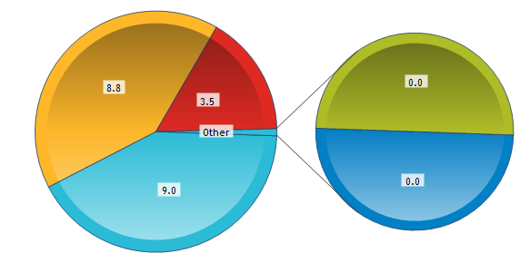
I've just submitted my continuous professional development records to the professional body I'm a member of. They use a rather clunky data entry web form, and once everything goes through you get some dashboards (of course!). The code behind dashboard generation is quite inflexible, it really couldn't believe I would give it zero for red, blue and green metrics, so it still zooms on them in a second pie chart, where 3 zeroes take a third of the pie each. Is there an official name for this shaded pie-chart? Soup bowl perhaps?
My recorded CPD hours can be compared to the whole set of the same membership category as me, whose results come in pie charts.| set mean |
| set median |
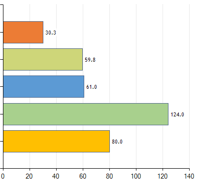
Now going to the bar chart showing all categories with a choice of metric between Mode, Mean and Median. Mode is a really odd choice for what is really a continuous metric, and sure enough, by selecting it I get an error:
The means and the medians are shown belowOne or more CPD Hours sets has no single modal value
| Mean |
The meager 30.3 is me. The dark green has the same mean and median (124) so I would hazard a guess that it is a set of only one member, especially given the mean is round. It's interesting that for the other sets the median is just over half the mean, but we know that at this point they might also have very few members values all over the place. Or an uber keen minority in each set is skewing the mean upwards.
Median
The blue is my set. The mean of 107.2 matches the total of the set average pie chart. That is not the case with the median, but of course the sum of medians is not the median of the sums, whereas the sum of averages is the average of the sums. The fact the sum of medians is actually much smaller than the median of sums, shows us that most members of the set don't divide their time equally. There's scope for a whole other post on statistics of statistics here, I'll do that some other time.
Wednesday, 15 March 2017
Big Data World day 1 review
This event was today at Excel in London. It is handily co-located with Cloud and Smart IoT events, which was a major draw for me, as I am not strictly speaking a data/IT guy, more of an analyst and wannabe subject matter expert with IoT and increasingly cloud within my professional interests. As the write up is quite long the following list of links lets you jump to the summary of the relevant presentation:
I did start from the Cloud Expo end of the room as there was a whole 'theatre' devoted to talks on software defined networks. Judging from the first presentation which looked at SD-WANs, these guarantee the exact opposite of net neutrality to business users, prioritising cloud business applications at the expense of e.g. YouTube traffic. The technology involves 'aggregating and orchestrating' a variety of links of varying performance and availability from MPLS and 3G to old school internet, and intelligent path control for different applications' traffic, e.g. routing VoIP traffic through MPLS, thus being able to guarantee QoS above 'best effort'. Interesting ideas on SLAs for application uptime and even application performance could extend the current SLAs of network availability. To my simplistic brain, it would all be simpler and safer if we keep most applications offline and standalone, instead of putting everything on the cloud, but there's a cloud enabled industrial revolution in progress, which involves cost cutting and getting rid of half the IT department. Clearly that is the main driver, with the downside being increasing demands on the network.
In complete contrast, I moved on to a presentation in the Big Data World area on the General Data Protection Regulation. This made me feel suddenly quite nostalgic for the good old EU, its much maligned courts and the human right to a private life. The list of non EU countries that conform to european data protection standards is interesting to say the least: Andorra, Argentina, Canada, Faeroe Islands, Guernsey, Israel, Isle of Man, Jersey, New Zealand, Switzerland and Uruguay. Maybe there's material there for a tableau map and some spatial insights!
Next was SelectStar, a database monitoring solution. Their main selling point is being a single monitoring tool for all database technologies, as increasingly companies will have a mixture of open source and proprietary relational and NoSQL solutions, rather than be an e.g. 'all Oracle' house. I was hoping to get some tips on actual monitoring of the health of a Hadoop cluster, but they don't do much in addition to what the built in Hadoop monitoring tools offer, in fact Hadoop is quite a recent addition to their offerings.
I try and balance attending presentations relevant to my job to things that are just plain interesting. In the spirit of the latter, I went to the 'deep learning' keynote, which as one member of the audience noted, was using mostly image recognition examples. The presenter explained that they make good presentation material, and the technique has wider applications. The key thing I took from this was that the feature extraction is now also 'trainable', whereas in old school machine learning only the classification stage was. I'm not fully convinced machines are better than humans at deciding what the best feature vector is, and I should read up on any speech/music processing applications of this as I have a better theoretical grounding in that field. Would a machine ever come up with something as brilliant but crazy as the cepstrum?
I next attended a talk on deriving 'actionable insight' from data. This is now such a cliche that is a bit meaningless, especially when the whole brigade of viz whizz kids are into dashboard visualisations with little accompanying text, carrying little of the insight a well illustrated text heavy report will give you. Refreshingly, and perhaps tellingly on the differing priorities of the private and public sector data world, the speaker used no visual material whatsoever. He just talked about his work as a data analyst for Peterborough city council, and projects such as identifying unregistered rental properties by fusing a variety of datasets including council tax and library user details, or analysing crime patterns! I should look into what open data offerings they have.
The weather company, finally a (nearly) household name, was next, in a keynote on weather for business. They interestingly crowdsource some of their data to achieve 'hyperlocal' resolution of 500m, 96 times a day globally, while a major sector of their corporate customers, airlines, are also data providers. They have a unique data processing platform and the speaker did put a certain emphasis on their acquisition by IBM and the 'insights and cognition' synergies that will result from it.
I then ventured into the Smart IoT area for a talk from O2/Telefónica. The data protection theme was present here again as they make sure their data is secure and anonymous via aggregation and extrapolation, and a certain amount of weeding out of any data that is not aggregated enough and therefore could be used to identify individual users, and users consenting to the use of their data also came up during question time. They derive location via both 'active' (calls) and 'passive' (cell handovers) means, as well as behavioural data from apps and websites visited, and 'in venue' information from their wifi hotspots and small cells (another hint at the seamless integration of multiple networks mentioned earlier). This builds up to 6 billion events on a typical day, and they keep an archive of 4 years. These events are classified into 'settles' and 'journeys', analysed to identify origins and destinations, with uses ranging from transport planning, audience profiling, retail decision making etc.
Back to the other end of the hall to hear self professed ubergeek Andi Mann of Splunk on DevOps . Follow the link as he can summarise his ideas much better than I can. He gave me another interesting fact on Yahoo's past as a cool tech parent company, despite today's headlines on security breaches: the presentation on dev and ops cooperation at Flickr that was key to starting the devops conversation back in 2009. I think the idea of devops has applications outside software, in fact a lot of the operational intelligence work I do sits somewhere between operations and product/service development.
I did skip the QlikView presentation for the sake of Splunk, but came back to the Big Data keynotes for Esri. Their presentation focused on the benefits of spatial analysis, giving the grid aggregation I wrote about in the past as an example, along with navigation, fraud transaction detection and even insurance for ships going into pirate infested waters!
Finally a joint act between Wejo and Talend on their connected car project. This was interesting for many reasons, from the technologies involved on the car such as eCall to the technology used for data processing, as Talend offers an open source ETL tool that can sit on top of Spark. On that latter front there was a certain emphasis on the benefits of having a unified infrastructure for batch processing and streaming, and a mention of the Apache Beam project as something Talend will support in the future to that end.
In the time left between all this I got to talk to some of the exhibitors. The most intriguing one was a Belgian company who make Anatella, which would catch the eye of anyone working in telecoms for their binary CDR processing capability. The demos included some fascinating social network graph analysis derived from phone calls: e.g. flemish speaking belgians tend to call other flemish speaking belgians and french speaking belgians tend to call other french speaking belgians, with the exception of Brussels, which proves to be bilingual territory not only in constitutional theory but also in telephony practice! There was a news story a few years ago on similar telephone 'connections' between UK regions, I remember Wales being split in three north to south, with more contact with the corresponding adjacent english region to the east than the rest of wales north and/or south. Fascinating work that can escape the narrow confines of marketing into proper Geography research, not unlike the work of the Flowminder Foundation that I link to on the right.

- SD-WAN (Cloud Expo)
- General Data Protection Regulation
- SelectStar database monitoring tool
- Deep Learning
- Deriving actionable insight from data
- The weather company
- O2 Telefónica (Smart IoT)
- Data for DevOps (Cloud Expo)
- Esri on Spatial Analysis
- Talend and Wejo on connected car
- ETL for CDRs with Anatella
I did start from the Cloud Expo end of the room as there was a whole 'theatre' devoted to talks on software defined networks. Judging from the first presentation which looked at SD-WANs, these guarantee the exact opposite of net neutrality to business users, prioritising cloud business applications at the expense of e.g. YouTube traffic. The technology involves 'aggregating and orchestrating' a variety of links of varying performance and availability from MPLS and 3G to old school internet, and intelligent path control for different applications' traffic, e.g. routing VoIP traffic through MPLS, thus being able to guarantee QoS above 'best effort'. Interesting ideas on SLAs for application uptime and even application performance could extend the current SLAs of network availability. To my simplistic brain, it would all be simpler and safer if we keep most applications offline and standalone, instead of putting everything on the cloud, but there's a cloud enabled industrial revolution in progress, which involves cost cutting and getting rid of half the IT department. Clearly that is the main driver, with the downside being increasing demands on the network.
In complete contrast, I moved on to a presentation in the Big Data World area on the General Data Protection Regulation. This made me feel suddenly quite nostalgic for the good old EU, its much maligned courts and the human right to a private life. The list of non EU countries that conform to european data protection standards is interesting to say the least: Andorra, Argentina, Canada, Faeroe Islands, Guernsey, Israel, Isle of Man, Jersey, New Zealand, Switzerland and Uruguay. Maybe there's material there for a tableau map and some spatial insights!
Next was SelectStar, a database monitoring solution. Their main selling point is being a single monitoring tool for all database technologies, as increasingly companies will have a mixture of open source and proprietary relational and NoSQL solutions, rather than be an e.g. 'all Oracle' house. I was hoping to get some tips on actual monitoring of the health of a Hadoop cluster, but they don't do much in addition to what the built in Hadoop monitoring tools offer, in fact Hadoop is quite a recent addition to their offerings.
I try and balance attending presentations relevant to my job to things that are just plain interesting. In the spirit of the latter, I went to the 'deep learning' keynote, which as one member of the audience noted, was using mostly image recognition examples. The presenter explained that they make good presentation material, and the technique has wider applications. The key thing I took from this was that the feature extraction is now also 'trainable', whereas in old school machine learning only the classification stage was. I'm not fully convinced machines are better than humans at deciding what the best feature vector is, and I should read up on any speech/music processing applications of this as I have a better theoretical grounding in that field. Would a machine ever come up with something as brilliant but crazy as the cepstrum?
I next attended a talk on deriving 'actionable insight' from data. This is now such a cliche that is a bit meaningless, especially when the whole brigade of viz whizz kids are into dashboard visualisations with little accompanying text, carrying little of the insight a well illustrated text heavy report will give you. Refreshingly, and perhaps tellingly on the differing priorities of the private and public sector data world, the speaker used no visual material whatsoever. He just talked about his work as a data analyst for Peterborough city council, and projects such as identifying unregistered rental properties by fusing a variety of datasets including council tax and library user details, or analysing crime patterns! I should look into what open data offerings they have.
The weather company, finally a (nearly) household name, was next, in a keynote on weather for business. They interestingly crowdsource some of their data to achieve 'hyperlocal' resolution of 500m, 96 times a day globally, while a major sector of their corporate customers, airlines, are also data providers. They have a unique data processing platform and the speaker did put a certain emphasis on their acquisition by IBM and the 'insights and cognition' synergies that will result from it.
I then ventured into the Smart IoT area for a talk from O2/Telefónica. The data protection theme was present here again as they make sure their data is secure and anonymous via aggregation and extrapolation, and a certain amount of weeding out of any data that is not aggregated enough and therefore could be used to identify individual users, and users consenting to the use of their data also came up during question time. They derive location via both 'active' (calls) and 'passive' (cell handovers) means, as well as behavioural data from apps and websites visited, and 'in venue' information from their wifi hotspots and small cells (another hint at the seamless integration of multiple networks mentioned earlier). This builds up to 6 billion events on a typical day, and they keep an archive of 4 years. These events are classified into 'settles' and 'journeys', analysed to identify origins and destinations, with uses ranging from transport planning, audience profiling, retail decision making etc.
Back to the other end of the hall to hear self professed ubergeek Andi Mann of Splunk on DevOps . Follow the link as he can summarise his ideas much better than I can. He gave me another interesting fact on Yahoo's past as a cool tech parent company, despite today's headlines on security breaches: the presentation on dev and ops cooperation at Flickr that was key to starting the devops conversation back in 2009. I think the idea of devops has applications outside software, in fact a lot of the operational intelligence work I do sits somewhere between operations and product/service development.
I did skip the QlikView presentation for the sake of Splunk, but came back to the Big Data keynotes for Esri. Their presentation focused on the benefits of spatial analysis, giving the grid aggregation I wrote about in the past as an example, along with navigation, fraud transaction detection and even insurance for ships going into pirate infested waters!
Finally a joint act between Wejo and Talend on their connected car project. This was interesting for many reasons, from the technologies involved on the car such as eCall to the technology used for data processing, as Talend offers an open source ETL tool that can sit on top of Spark. On that latter front there was a certain emphasis on the benefits of having a unified infrastructure for batch processing and streaming, and a mention of the Apache Beam project as something Talend will support in the future to that end.
In the time left between all this I got to talk to some of the exhibitors. The most intriguing one was a Belgian company who make Anatella, which would catch the eye of anyone working in telecoms for their binary CDR processing capability. The demos included some fascinating social network graph analysis derived from phone calls: e.g. flemish speaking belgians tend to call other flemish speaking belgians and french speaking belgians tend to call other french speaking belgians, with the exception of Brussels, which proves to be bilingual territory not only in constitutional theory but also in telephony practice! There was a news story a few years ago on similar telephone 'connections' between UK regions, I remember Wales being split in three north to south, with more contact with the corresponding adjacent english region to the east than the rest of wales north and/or south. Fascinating work that can escape the narrow confines of marketing into proper Geography research, not unlike the work of the Flowminder Foundation that I link to on the right.
Labels:
Big Data,
CDR,
data protection,
GIS,
Hadoop,
IoT,
maps,
open data,
Splunk,
Telecommunications data,
Tools,
Yahoo
Friday, 10 March 2017
The chimney map
As this blog is among other things about maps, here's a fascinating documentary on a very old map found in Scotland and restored at the national library of Scotland.
Open Data Camp
The 2017 Open Data Camp was at the end of last month in Cardiff. I was told about it in a semi-private exchange with Chris Love. I couldn't make it, but a lot of information is online, the session grid gives you a good overview and links to any info published online. See 'Open data for newbies' for a quick introduction to the subject, among other things it makes the vital distinction between public and open data. Data in pdf seems to be the running joke, though last I heard, Tableau is promising a pdf connector!
There are some fascinating sessions, such as 'how to get 1 million people speaking welsh', which of course begs the question of how can you define, measure and model the growth of welsh speakers. There's also a minecraft session, unsurprising, I've seen a demonstration of LiDAR data in Minecraft in last year's Cambridge Dorkbot.
Sunday, 26 February 2017
Layering marks and polygons on map
This is a trick that has become much simpler to perform since the introduction of union in Tableau 9.3.
We start with two data files, one with the vertices of our polygons and another with the locations where we want the marks. We create a union of those two when we create our tableau data source.
the wildcard union is particularly handy for multiple files so keep it in mind, in this case we don't really need it. What we then need to do is select the Latitude and the lat columns, right click and select 'Merge mismatched fields', likewise for the longitudes.
Then we can create our map with these merged latitudes and longitudes, but we really want to create two maps, one for each layer. Here's how to create the marks map:
Beware of the averaged coordinates, if you don't put all the dimensions in the level of detail you might not get a mark for each row in your dataset! And here's how to create the polygon:
Now we need to select dual axis and right click and hide the 'Null' location.This will give us the desired two layer map.
As it happens, my marks are the centroids of post-codes. So we can tell tableau that through the geographic role of the location field, and select filled maps as the type of mark to get the postcode polygon instead of the dot at the centroid. Note that the (generated) Latitude and Longitude is no good for this as it is not visible when editing the source and cannot be merged with the mismatched latitude longitude of the polygon source after the union, they can't even be used in calculated fields which could be another way round (the pre-9.3 way of doing things). So an original text only source might have to be imported into tableau and the generated coordinates will have to be copied to a new source to use for a union.
We start with two data files, one with the vertices of our polygons and another with the locations where we want the marks. We create a union of those two when we create our tableau data source.
the wildcard union is particularly handy for multiple files so keep it in mind, in this case we don't really need it. What we then need to do is select the Latitude and the lat columns, right click and select 'Merge mismatched fields', likewise for the longitudes.
Then we can create our map with these merged latitudes and longitudes, but we really want to create two maps, one for each layer. Here's how to create the marks map:
Beware of the averaged coordinates, if you don't put all the dimensions in the level of detail you might not get a mark for each row in your dataset! And here's how to create the polygon:
Now we need to select dual axis and right click and hide the 'Null' location.This will give us the desired two layer map.
As it happens, my marks are the centroids of post-codes. So we can tell tableau that through the geographic role of the location field, and select filled maps as the type of mark to get the postcode polygon instead of the dot at the centroid. Note that the (generated) Latitude and Longitude is no good for this as it is not visible when editing the source and cannot be merged with the mismatched latitude longitude of the polygon source after the union, they can't even be used in calculated fields which could be another way round (the pre-9.3 way of doing things). So an original text only source might have to be imported into tableau and the generated coordinates will have to be copied to a new source to use for a union.
Friday, 24 February 2017
Alternative maps
Don't get me wrong. I don't read defense magazines. The extracts below are from the Radio User magazine, that I used to get both from a professional interest in maritime and aero communications and a hobby interest in shortwave and medium wave listening ( DX-ing). It is an excellent source of information on ADS-B and AIS as well as general search and rescue and safety comms, and of course long distance broadcasting and propagation conditions.
It does however also cater for plane spotters and scanner enthusiast following military exercises, hence the 'alternative' map of Scandinavia below. The description of the made up fringe country between Norway and Iceland is hilarious, any similarities to Brexit island are purely coincidental
The challenge as always of course is how to re-make the map in Tableau. To make my life easier I'm ignoring the made up internal borders inside Sweden and Finland, and focusing on relocating New Zealand to the North Atlantic.
Lets start with a dataset listing the necessary countries. Tableau is very good at mapping them in their usual locations.
But how do we move New Zealand? Let's have a go extracting the generated coordinates and fiddling with the numbers. We select the countries on the map, view the data and it's a rare case that the summary has more info (generated coordinates) than the full data. Select everything and copy into the csv creator of choise, any spreadsheet application will do.
Now move New Zealand to its 'alternative' position, lets say 60N 5W, remove the (generated) from the header, save the csv and re-import into Tableau.If you put the new coordinates on X and Y you get dots at the right places. But change to a filled map and New Zealand stubbornly refuses to move from the Pacific to the Atlantic.
Ok so clearly Tableau is doing things behind the scenes. Of course it has to as we haven't specified the relative size of the countries. Let's do that by adding the area of each country in another column. So can we escape by setting the geographic role to 'None'?
It has flattened Norway, so it is sort of re-projecting the shape from Mercator projection. But everything is in the wrong place, and we've pushed the size as far up as possible. Bear in mind that we have another weapon in our disposal, zooming. Tableau doesn't zoom into the marks at the same magnification levels that it zooms into a map. You can see this by zooming into my Makeover Sunday II map. In this case, we want to zoom out to see if it gels the countries together.
So it's not that simple. At this point we give up and leave it for another day.
Subscribe to:
Posts (Atom)