Monday, 8 May 2017

It's the economy, stupid!

So I was listening to my BBC local station yesterday. Have you noticed how rather mediocre radio stations make a bit of an extra effort in their weekend programming? Normally this involves some specialist music shows, but BBC Cambridgeshire also has the Naked Scientists . One of the themes of the evening was language, and one of the featured scientists (hopefully not naked) was the economist Keith Chen. The fact he is not a linguistics professor is a crucial thing to note, as well as the fact that he teaches in the school of management and not in the economics department. But I digress.

Keith Chen's main point was that people speaking a language that has an explicit future tense (such as English or Greek) don't save as much money, don't take as much care of their health etc. compared to speakers of languages that don't have a future tense (aparently German is such a language). For the nuanced argument you can read the relevant paper which I have only skimmed through but hey, this is a blog, we don't take ourselves too seriously.

One of his main sources of data is the world values survey. The first thing I notice on visiting their site is the beautiful magic quadrant visualisation known as the Inglehart–Welzel Cultural Map, or occasionally the Welzel-Inglehart Cultural Map. This immediately screams 'Samuel Huntington Clash of civilisations' to me, but I haven't read that book either so I won't get carried away. Just notice how countries are bundled together in mysterious ways: Azerbaijan occasionally becomes orthodox, Israel and Greece catholic, the English speakers are of course exceptionally neither protestant nor catholic even though they could be either or neither, and the colouring does or doesn't always follow the religion, or the cluster, which contorts around accordingly.


So this wonderful source of data proves that future tense equipped languages like the ones mentioned above have speakers that don't plan for the future, and vice versa. The examples quoted included of course the UK and Greece as the worst savers in Europe. This tempted me to use the website facilities to get the table embedded below: 

TOTALCountry Code
CyprusGermany
Save money42.8%13.9%57.0%
Just get by38.4%66.3%24.7%
Spent some savings and borrowed money9.1%12.2%7.6%
Spent savings and borrowed money6.6%5.8%7.1%
DE,SE:Inapplicable ; RU:Inappropriate response; BH: Missing; HT: Dropped out survey0.2%-0.3%
No answer1.7%-2.6%
Don´t know1.1%1.9%0.8%
(N)(3,046)(1,000)(2,046)
To me this data says one thing: People in Germany were well off at the time of the survey, and people in Cyprus were much less well off. When you have money to spare, you save, when you don't you get by, and that has little to do with your language and the way it expresses future events. It has a lot more to do with employment going up or down, banks doing well or being about to collapse, and the euro being too strong or too weak in relation to the country's economic health. In fact Chen went as far as citing Belgium, as an example of where everything else being the same, language is the only factor differentiating people. Perhaps he should check out some call record analysis proving that Belgium is really two parallel societies that meet in Brussels!

I was planning to finish on a note about the sad state of linguistic research but it would be wrong, actually the fact he is in the management school explains the unique blend of positivist prejudice displayed here.

Saturday, 6 May 2017

Histograms and data driven aggregation

Unavoidably, once you start taking your work seriously as 'data science' you have to do hypothesis testing. And to do hypothesis testing you need to know the distribution of your data. And the most intuitive way to see the distribution of your data is to plot a histogram.

So in that context, we have a go at plotting a histogram of a field in our data. The advice of our 'big data' provider is - you guessed it - pull data from Hive into a Spark data frame, do some operations, convert to RDD, do some more operations. I'm too lazy for all that so digging around I found that Hive has a histogram function. You might not like the idea as it returns an array of structures that contain the bin centres and the respective frequencies, and it uses some funky binary delimiters, different for the struct fields, the array elements and of course the fields returned by the query. This is complicated enough to merit its own post which I promise to do in the future, but in my book still preferred: No need to do 20 (or 50?) lines of configuration and functional programming where a SQL one-liner would do.

Anyway, having done that I was looking at another field for which we also needed a histogram, and realised that it is really a discete measurement, it was a number somewhere between 40 and 80 that only came with .00, .25, .50 and .75 in the decimal places. Maybe an unsigned 8 bit quantity at the point of measurement/analog to digital conversion? Anyway, that means that to do a histogram you can avoid the binning all together, the data is pretty much 'pre-binned'. Instead it becomes more like the first classic example of any Map Reduce related tutorial: a word count.  How many times does e.g. 50.25 appear in the data, and likewise for all values.

Knowing your data can always save time and effort when trying to analyse it. A key reason to like Tableau is the way it allows you to learn what your dataset looks like and explore it from all possible sides. I have to confess though, the final dataset was simple enough for the histogram to be done as a pivot-chart in Excel!

Monday, 1 May 2017

Why I'm learning Pig

I've made fun of the Apache Pig project the first time I came across it, but I take it back. I now fully see its value and I'm learning how to use it. As there is a lot of ignorant discussion online and offline claiming that Pig and Hive are equivalent tools and that the difference is one of syntax between SQL like (declarative) HiveQL and scripting style procedural Pig Latin, let me explain how I got convinced of the need to use both.

I came to Hadoop gaining access to a system set up for us by a cloud provider, and a lot (but not all) of the data I'm interested in being in HDFS and Hive tables. In that situation, it's taking me a while to figure out what every part of the Hadoop ecosystem does and how it could be useful to me. Hive was the one thing that seemed immediately useful and worth learning: it had a lot of data I was interested in, it sort of follows an accessible standard language (SQL), and it offers quite powerful statistics . An initial presentation on it from the provider claimed it could be used for Hypothesis testing, Predictive Analytics etc., and while that seems a bit misleading in retrospect, Hive can provide all the statistics needed by any specialist tool that does the testing or the prediction. So far so good. I did play with Spark a few times to figure out what it is and how it works, but the barrier to entry there seemed definitely higher: you have to worry about cluster configuration, memory etc. when you launch jobs and you have to use a lot of low level code (RDDs, closures etc.)

One of the knowledge exchange sessions with the provider was on Hadoop being used for ad hoc analysis. Their suggested process was: copy data to HDFS, load data into newly created Hive table, load data from Hive table into Spark dataframe, do certain operations, convert to RDD, do more operations. It seemed awfully complicated. When there was a need to do such analysis, I realised I needed to define a 44 column table schema when I only wanted to average one column grouped by the contents of another, and gave up on using Hadoop at all for the task. It bothered me that I didn't know how to do something this simple on Hadoop though, so I kept reading through books and searching online until Pig emerged as the obvious solution. The syntax for what I wanted to do was ridiculously easy:
file_data = LOAD 'hdfs://cluster/user/username/file.csv' USING PigStorage(',');
raw_data = FILTER file_data by $0!='field0_name';
data_fields = FOREACH raw_data GENERATE $11 AS file_dimension,  (int)$43 AS file_measure;
data_group = GROUP data_fields by file_dimension;
avg_file_measure = FOREACH data_group GENERATE group,AVG(data_fields.file_measure) AS file_measure_avg;
This example embodies certain aspects of Pig's philosophy: Pigs eat everything, without necessarily requiring a full schema or being particularly difficult about the delimiter field, or the presence of absence of the csv header (which I filter out in the second line of the example). Pig can go even further working with semi-structured and unstructured, non normalised data, that would be entirely unsuitable for Hive without serious processing. Pigs are domestic animals and rather friendly to the user. One of the early presentations on Pig stated that it "fits the sweet spot between the declarative style of SQL, and the low-level, procedural style of MapReduce". I would dare say that this statement could be updated for the Hadoop 2 world with Spark in place of MapReduce, so it is unsurprising that Pig is still heavily used for ETL and other work on Hadoop, and Pig on Spark is in the works (hopefully delivering on the Pigs fly promise). A final point that Pigs live anywhere should comfort anyone worried about learning such a niche language: it is also supported e.g. on Amazon EMR.

So in retrospect: An organisation can adopt Hadoop and throw all its data into a 'data lake' in HDFS. Any competent programmer in that organisation can then use an array of programming approaches (Pig, raw MapReduce, Spark) to analyse this data, some faster to program, others more powerful but requiring more programming effort. This is the fabled 'end of the data warehouse' but only possible if the users of the data can do their own programming. If on the other hand the organisation wants to enable access to the data to non programmer analysts, connect standard BI tools to the data etc. then they adopt Hive, but have to do a lot of the same work that is required for a traditional data warehouse: ETL, normalisation etc. The main advantage of Hive compared to traditional DWH is being able to cope with Big Data that would ground an RDBMS to a halt. In most cases probably a happy medium is reached where key data is in Hive tables, but a lot of other 'niche' data stays in non-structured or non-normalised formats in the data-lake. I have not addressed where NoSQL databases fit into this picture, I promise to come back on the subject when I have a similar NoSQL epiphany.

Saturday, 29 April 2017

Cambridgeshire and Peterborough is a two horse race

In the wider context of the cult of the leader/CTO, Cambridgeshire and the Peterborough unitary authority are bundled together for a devolved mayor election, with a budget for the mayor to tackle housing and transport. To her credit, the green candidate at least proposes forming an assembly to keep this leader in check, but there is little chance of a green mayor. Local election literature told us time and again that it's a two horse race. But which two horses?
Labour have been using the only previous result that covers the same geographical area with a similar electoral process, and helpfully, shows them as the only ones that can beat the tory. They also foolishly put it on their website in jpeg format, with discrete cosine transform artifacts and all. Next time please use png guys!
But the mayor would have important make or break powers on a number of important issues. Houses in Cambridge are about as overpriced as in London. A new train station has led to redevelopment and price hikes in formerly affordable Chesterton as developers prepare to house even more London commuters. Peterborough of course has been discussed in the national press in a number of 'this is why Brexit happened' articles. This election is likely to be taken far more seriously by voters than the police and crime commissioner one in 2016.
On the other hand, Lib Dems are doing something even worse, using the Cambridgeshire county council results that wouldn't include any Peterborough votes at all. After all they still have residual support in Cambridge from back in the day when they were the anti-war, anti-fees party to the left of New Labour, whereas in Peterborough the Tories are much stronger, and they are a distant third party.
For more close monitoring of election visualisations, see Phil Rodgers' blog  .

Tuesday, 28 March 2017

Statistics of statistics


In looking at the pie charts of CPD hours we found that the sum of averages was the average of the sums, whereas the sum of medians was much smaller than the median of the sums. This is another way of saying that the average is a linear function, i.e. it is true that


f(ax+by)=af(x)+bf(y)
whereas the median is non linear. This is quite important from a visualisation point of view as pie charts, stacked bar charts, area graphs etc. imply that the sum of the parts is a meaningful quantity, and in the case of non linear aggregations (median, countd) often it isn’t.

In tables Tableau addresses this with ‘grand total’, the aggregation for which doesn’t have to be a sum but could be e.g. an overall median. If you’ve been careful to never imply the parts can be summed but still find your users exporting data and doing sums in excel, adding a table view with a grand total configured to the suitable aggregation can save you from hours of arguing!

Another case of statistics of statistics in Tableau can arise when using Level of Detail Calculations. I used to do this manually by doing counts at ‘exact date’ level of detail, exporting the counts to excel, re-importing the counts to tableau and then finding the weekly maximum of the counts, effectively using Tableau as my data warehouse/ETL tool as well as the analysis and visualisation tool. The emergence of Level of Detail calculations saved me from all this bother, as now I could plot a
max({fixed [date]:count([x])})
against the date to the nearest week.

Of course there are also cases of using data from a proper data warehouse, whether the traditional RDBMS one or Hive. In that case again it is worth being careful to match any aggregation done in Tableau to the aggregation done in the data warehouse. e.g Min([min_x])can’t go wrong, but the averages can be a bit tricky. Say the original SQL was
SELECT avg(x) AS avg_x GROUP BY d
where d1 has 1 record and d2 has 100! Coming then in Tableau to do an avg([avg_x]) is just asking for trouble. Instead modify the SQL to
SELECT avg(x) AS avg_x, count(1) AS n GROUP BY d
and then we can get the proper average in Tableau with
SUM([avg_x]*[n])/SUM([n])

Monday, 27 March 2017

Politicians for analytics and analytics for politicians


MP Daniel Zeichner (Labour) has set up a data analytics all party parliamentary group. The membership of the group includes Labour and Conservatives, a token Lib-Dem and an ex-hereditary cross bencher lord. The SNP, a far more important player in this parliament than the Lib Dems, is not represented.
On the other side of the political mainstream, David Willetts as a Universities and Science coalition minister a few years ago identified Big Data as one of the 8 great technologies that could guarantee of future growth of the British economy along with space, robotics and autonomous systems, synthetic biology, regenerative medicine, agri-science, advanced materials and energy. Space was probably closer to his heart, and he retired to a position on the board of satellite maker SSTL.
Of course data analytics have been at the heart of British political debate for a while now: the fixation with quantifying performance and ranking schools and hospitals has been central to any discussion on education and the NHS, the central issues for the Blair and Cameron governments correspondingly. The Blair government has been pivotal with its ideas about evidence based policy for our supposedly post-ideological times.
We’ve already seen the increasing importance of data in local government which is tied to the emergence of ‘Smart Cities’, while mobile telecoms mined data is used for things like transport planning. For that most political of issues, data protection, the increasing contradictions between the incoming EU GDPR and the UK’s snooper charter might be partially resolved by Brexit, though the UK in its typical way might be quite relaxed about following EU regulations while still obliged to do so, and the media will play its part in making snooping palatable to the voters.  

Monday, 20 March 2017

data @peterborough.gov.uk

Following on from the talk from a Peterborough council employee in Big Data world, I had a look for their open data. They have an impressive portal at http://data.peterborough.gov.uk/ , the platform in use (Data Share) is developed by the London borough of Redbridge.

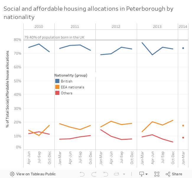
I chanced upon the topical dataset of split of social and affordable housing allocations between British nationals, Europeans and other foreigners. This is of special interest not only because the issue of EU citizens benefits has been at the centre of the Brexit debate, but also because Peterborough has been singled out in a couple of newspaper articles as a place that helps understand the brexit vote (already from the last general election, following the UKIP referendum campaign, and in the aftermath).

Data share has a funny start page where you follow one link to view data and another to download it, each leading to categories of datasets, and each category's link to the list of datasets in the category. Quite a lot of clicking through, especially if you first view and then decide to download. Thankfully there is actually a download button in the viewing area.

Viewing the data shows a table but gives some other options, the interface reminds me a bit of the built in visualisations in the Zeppelin Notepad.
This doesn't live up to the promise though, try any view other than the table and what you get is a visualisation of the number of records in the table per value of the dimension selected for the category axis, not even fitting in one page and not in chronological order either!
It does look like the Peterborough data and the Data share platform haven't been tuned to work with each other when it comes to visualisation. Changing the dimension for the category axis becomes even more revealing:
So this is a bit like the modal value of my CPD hours :) . I have a visualisation telling me that there are two records/quarters in the dataset for which there were 197 houses allocated to british nationals, as opposed to having only one quarter for which 200 houses were allocated. This might interest a conspiracy theorist with numerology fixations, but is far from insightful. Downloading the data and playing with it even in excel can get you a bit further, though the 'Apr-Jun 10' format is not great. Instead we load into tableau, split the period and modify the year to four digits:
'20'+TRIM( SPLIT( [Period], " ", 2 ) )
We also pivot the various nationalities to give a more tableau friendly format
 The remaining issue is the occasional 0-3 value, which might be there to 'anonymize' the dataset rather than single out the hypothetical one Czech family that got a council house in a particular quarter of a particular year. Change the data type to number(whole) which is fine with all other values and gives null for the 0-3 and then add another calculation
ifnull([Pivot Field Values],3)
I could have used zn and turned them to zeros, but if the hypothesis we are investigating is 'the bad immigrants take all the houses' we need to take the 'worst' case scenario. Now the total number of houses allocated fluctuates so looking at percent of total allocations with the table calculation computed at the cell level (i.e. percent of the total for the quarter) we can see how the relative percentages of nationalities fluctuate. As the nationalities are already partially grouped, I group the eastern Europeans in with the rest of the EEA nationals. I also stick in one crucial number from the UKIP campaign Grauniad article: 79.4% of Peterborough's population were born in the UK. Of course there are plenty of British nationals not born in the UK, but lets use what numbers we have at hand.

The end result shows that the percentage of British nationals getting social and affordable housing hovers just under the percentage of British born people in Peterborough. I can guess here that if you are rich or at least well off in Peterborough you are more likely to be British (an assumption that wouldn't necessarily hold in London), so we really need the percentage nationalities of people who can't afford market rent in Peterborough. But in any case it shows that things are not as bad as the benefit tourist story wants you to think. After all many of the EEA nationals in council housing could be working in the warehouses mentioned in the more recent Grauniad article. Which boils the question down to why does the British government not enforce a living wage more strictly, if the benefit seekers are a drain on the national finances.